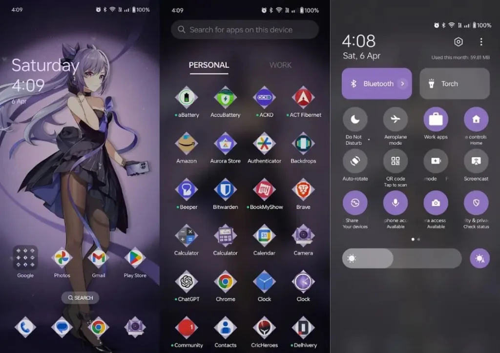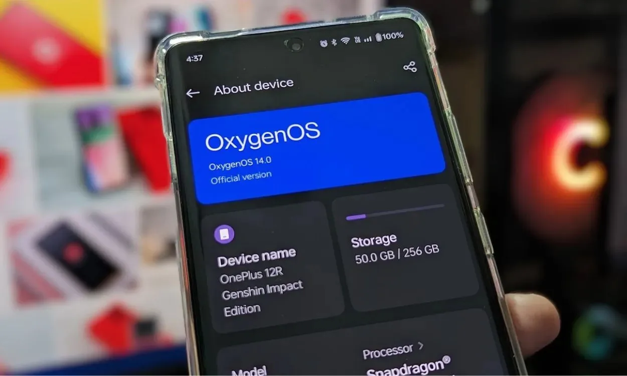
After enjoying a satisfying three-year stint with the Pixel 6, I initially had no intention of upgrading, especially with the anticipation of another major update for the phone. However, my plans took a turn when OnePlus unveiled the OnePlus 12R Genshin Impact edition. As a dedicated Genshin player and enthusiast, I couldn’t resist the allure and promptly made the switch. This decision entailed transitioning from Pixel’s UI to OnePlus’ OxygenOS, which is essentially a streamlined iteration of ColorOS.
Despite my previous reservations regarding OnePlus’ decision to amalgamate the ColorOS and OxygenOS codebases, acquiring the OnePlus 12R left me with no alternative but to adapt to OxygenOS. Surprisingly, my experience with it has been far from negative. In fact, it feels like a refreshing change of pace, surpassing my initial expectations.
Less Bloated Than Expected
I have a strong aversion to bloatware, which is one of the main reasons I tend to avoid mid-range devices, despite my curiosity about them. While a few pre-installed third-party apps may not seem like a big deal, dealing with an abundance of unnecessary first-party apps bombarding me with notifications on a daily basis detracts significantly from the pleasure of using a phone.

Fortunately, the software experience on the OnePlus 12R is refreshingly clean and devoid of clutter. The device comes with only two or three pre-installed apps, all of which can be easily uninstalled. Additionally, the number of first-party apps is kept to a minimum.Although I would have preferred apps like MyFiles, Weather, Games, and Internet to be uninstallable, they can be disabled without affecting the phone’s functionality. Although other mid-range OnePlus devices may have more third-party bloatware, the fact that they are uninstallable mitigates this issue to some extent.

In summary, the bloatware situation on the OnePlus 12R is comparable to that of Samsung devices. While the Pixel still reigns supreme in terms of software cleanliness, OnePlus manages to maintain a relatively clean software experience, which exceeded my expectations.
Relatively Clean User Experience
Personally, I’m not a huge fan of user interfaces overloaded with features. While software features can be beneficial, when they’re crammed into every nook and cranny of the UI, they tend to become counterproductive. With OxygenOS, I anticipated being inundated with features. However, I was pleasantly surprised to find that while it does offer a plethora of features, they are ones that I can envision myself using and adapting to, without compromising the overall cleanliness of the user experience.

Ultimately, it’s crucial for brands to carefully consider where to draw the line. While features can be a matter of personal preference, some users enjoy UIs packed with quirky features. However, it’s important to contemplate the question, “How much is too much?” and assess the potential impact of these features on the user experience. Brands must weigh the decision of whether to introduce a feature that only a small percentage of users will utilize or prioritize maintaining a clean user experience.
Switching from Pixel to OnePlus: Abundance of Useful Features
Speaking of features, I’ve often lamented the lack of even basic features on Pixel devices. However, since transitioning to OxygenOS, my desire for features has been satisfied. Although I might long for some features from the Pixel, I find that I can easily adapt with the help of OnePlus features like App cloning and Flexible Window.

The feature set of Pixel devices caters to a specific type of user, but my experience with the OnePlus 12R has revealed that I fall somewhere in the middle of the spectrum. While I do miss certain Pixel-exclusive features like Now Playing, Live Translate, and Transcribe, I’ve grown accustomed to the absence of features like Hold for Me and Call Screening in countries outside the US. It’s been so long since Google has considered expanding these features globally that I don’t find myself longing for the Pixel experience as much as I used to.
Outstanding Launcher: A Lesson for Google
A dedicated section on the OnePlus launcher highlights just how minimalistic the Pixel launcher truly is. As the Android launcher serves as my primary starting point for navigation, its design significantly impacts my user experience. I’m particularly fond of the OnePlus launcher for its plethora of handy features that streamline daily tasks.

From managing multiple apps to customizing icons, adjusting layouts, tweaking app labels, and implementing smooth transition animations, the OnePlus launcher offers a delightful user experience. Conversely, the Pixel launcher feels incredibly basic in comparison.
The Pixel launcher lacks essential features like bulk editing, built-in icon pack support, and per-app icon customization. While features like At a Glance are useful, it’s frustrating that they cannot be removed from the screen, with promised support perpetually delayed. In reality, “coming soon” often translates to a wait of at least two years.
Animations, Transitions, and Smooth Performance
I never anticipated saying this, but OxygenOS (ColorOS) provides a notably more refined Android experience compared to Pixel UI. While there are multiple contributing factors, one standout element is the animations and overall “feel of use.” This enhanced experience could partly be attributed to the hardware, as the OnePlus 12R features a higher refresh rate and a significantly superior display compared to the Pixel 6. Although I’ve used Android phones with 120Hz displays before, the smoothness on OnePlus devices feels consistently superior, if that makes sense.

Transitioning from Pixel to OnePlus: Final Reflections
Switching to a different UI after three years proved enlightening, and I’m delighted with my decision to opt for the OnePlus 12R. It meets my expectations in terms of specifications, and I realize now that I may have been overthinking the UI experience. OxygenOS 14 has been incredibly productive for me thus far, and I eagerly anticipate what OnePlus has in store for OxygenOS 15. Needless to say, I’ll be among the first to jump on the OxygenOS 15 Beta train. I’m pleased to report that the merger of ColorOS and OxygenOS wasn’t as disruptive as I had feared.
What are your thoughts on OxygenOS and ColorOS? How do you perceive them compared to stock Android and Pixel UI? Let us know in the comments below.


