The main attraction of Nothing Phones has been their user interface, offering a clean, nearly stock Android experience with Nothing’s distinctive touch. However, some users have criticized the current quick settings panel for appearing bland and clunky. It appears that the company has taken this feedback into account, as CEO Carl Pei unveiled a redesigned quick settings panel for Nothing Phones on X today.
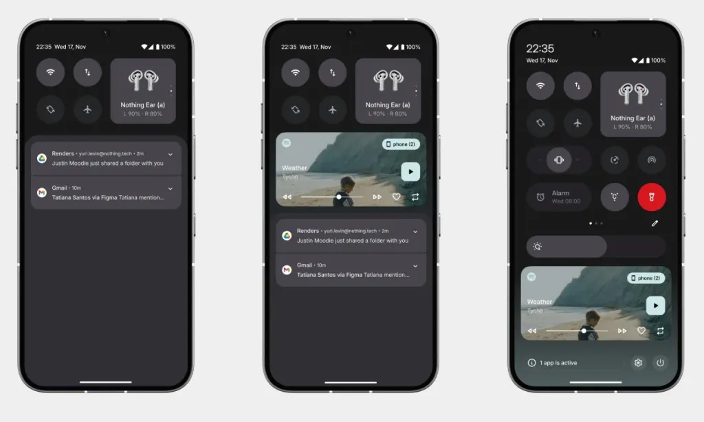
Pei posted two images of the new quick settings on X, one in dark mode and the other in light mode, on Tuesday. The images display the quick settings panel in both collapsed and expanded views, offering users a clear preview of its appearance.
The design retains a modern look while staying true to Nothing OS’ minimalist aesthetics. The pill-shaped Quick Settings toggle has been replaced with traditional circular icons. The WiFi toggle, which previously occupied a significant amount of space, is now smaller as expected. Additionally, mobile data now has its own toggle. However, the Bluetooth toggle remains similar, rectangular in shape, and displays a preview of connected devices.
In this concept, the brightness slider is thicker and relocated to the bottom for increased visibility and easier one-handed access. However, adjusting the brightness still necessitates fully expanding the quick settings panel. Additionally, a horizontal slider is introduced to toggle between Ring and Vibration modes.
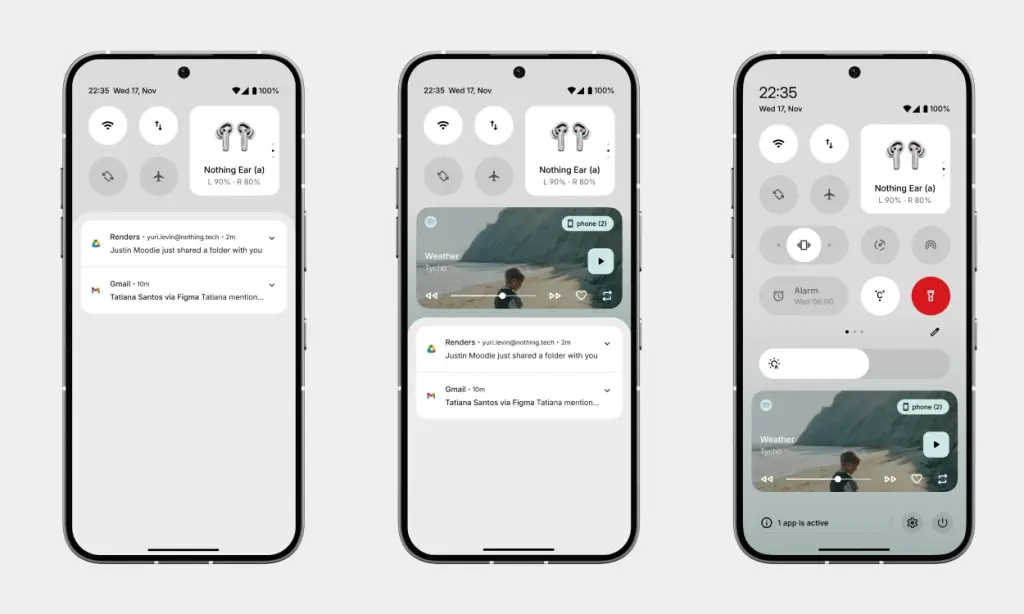
Sharp-eyed users will notice a gradient that appears when the Quick Settings panel is expanded, aligning with the colors of the album art. It would be a delightful addition if this gradient dynamically changed colors based on the album or currently playing content. As Carl mentioned, this feature is still in development, so we may see it with the release of Nothing OS 3 later this year.
I can’t help but notice the striking resemblance to the quick settings found on OxygenOS and ColorOS devices. While this new design appears more refined and polished, it may disappoint purists who preferred the close-to-stock pill-shaped look. Additionally, I observed the absence of the dot matrix font style for the clock, which I believe is a positive change as it was nearly unreadable.
There’s a lot happening with the design, but personally, I find it an improvement over what we currently have in Nothing OS 2.5. Perhaps a quick access button for ChatGPT could be a good addition as well? After all, Nothing has already incorporated other ChatGPT integrations in Nothing OS and its earbuds.
What do you think about the new quick settings design? Are you a fan of the new design, or do you prefer Nothing to stick with the current style? Share your thoughts in the comments below.


