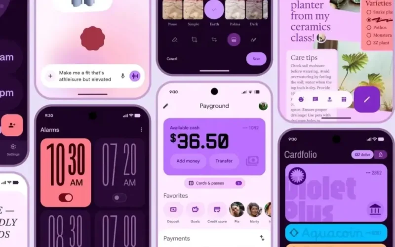
With Google I/O just around the corner, we’ve already caught glimpses of the upcoming Material 3 Expressive design language that’s expected to debut at the event. However, it looks like we won’t have to wait until then Google appears to have accidentally (or perhaps intentionally) published a full blog post detailing the redesign ahead of time.
The post revealed extensive information about the new design language but was quickly taken down. Fortunately, the Wayback Machine archived the blog, and while the images aren’t visible there, 9to5Google managed to capture and share some of them.
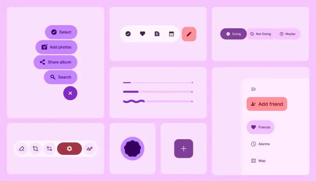
According to Google, Material 3 Expressive is built on core principles that “inspires emotion, communicates function, and helps users achieve their goals“. Further adding, “These design aspects are also fundamental to what makes a product more usable by drawing attention to what matters in the interface: Making key actions stand out, and grouping like elements together“.
The Mountain View-based company describes it as their “most-researched update to Google’s design system, ever.” This extensive research involved:
- Usability testing: Observing how quickly users could understand and navigate the interface
- Eye tracking: Studying where users focused their attention
- Surveys and focus groups: Measuring emotional responses to various designs
- Experiments: Collecting feedback on sentiment and preferences
All this testing and research helped Google shape the Material 3 design language. The feedback was “overwhelmingly higher rated” for qualities such as energetic, emotive, positive, creative, playful, and friendly. It also scored better in terms of style, with Material 3 designs showing a 32% increase in relevance, a 34% boost in modernity, and a 30% rise in perceived rebelliousness.

However, the redesign isn’t just about aesthetics. It also enhances usability helping users locate key components up to 4 times faster. Notably, it enabled users aged 45 and above to perform actions on par with younger users, improving accessibility across age groups.

With all these improvements, Material 3 Expressive is shaping up to be an exciting update to Android’s design language, and I’m eager to try it out. That said, not everyone is on board with the more expressive changes and UI elements that resemble One UI or OxygenOS. Where do you stand? Do you prefer the upcoming Material 3 design, or are you more fond of the current Material You aesthetic? Let us know in the comments below.


