
Android updates have been fairly dull for some time, and Android 16 seemed to follow that trend. But last week, it was revealed that Google is preparing a major UI overhaul called Material 3 Expressive and now we’re getting a first look at how this redesign will transform the stock Clock app.
Thanks to screenshots shared by Mystic Leaks, we now have our first look at the redesigned Google Clock app on Android. The images reveal a new font and noticeable updates to the bottom toolbar. The Clock tab has been renamed to World Clock, and the Alarms page has undergone a significant overhaul.
The app now features a new floating action button with a squircle shape, positioned on the right side. When you create or edit an alarm, it opens a sheet that replaces the analog clock time picker with an elongated time selector. This sheet also includes options for Alarm name, Sound, Vibrate, Weather forecast, and Google Assistant Routine.
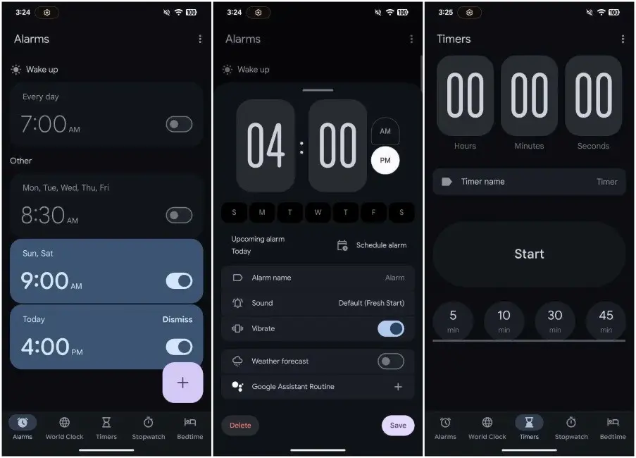
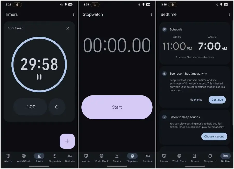
The Timer UI has seen a similar update, featuring elongated time selectors and replacing the play icon with a more rounded rectangular “Start” button. The font appears noticeably thicker than before. The Stopwatch tab drops its circular design in favor of a more cubical layout though personally, I preferred the previous look. Meanwhile, Bedtime mode remains mostly unchanged for now.
All these design changes feel like a significant departure from the familiar aesthetics of Material You. While it’s still early in the app’s development, I’m not a fan of the design inconsistencies so far. The shift from a smooth, rounded layout to a bulky circular-square motif feels jarring. It also takes up more space without using it effectively.
As my editor also noted, it feels like Google hasn’t settled on a clear design direction whether they want circular, square, or straight elements. At times, the approach seems almost random, and that’s exactly how the Clock app redesign comes across to me. But what do you think of the new look? Let us know in the comments below.


