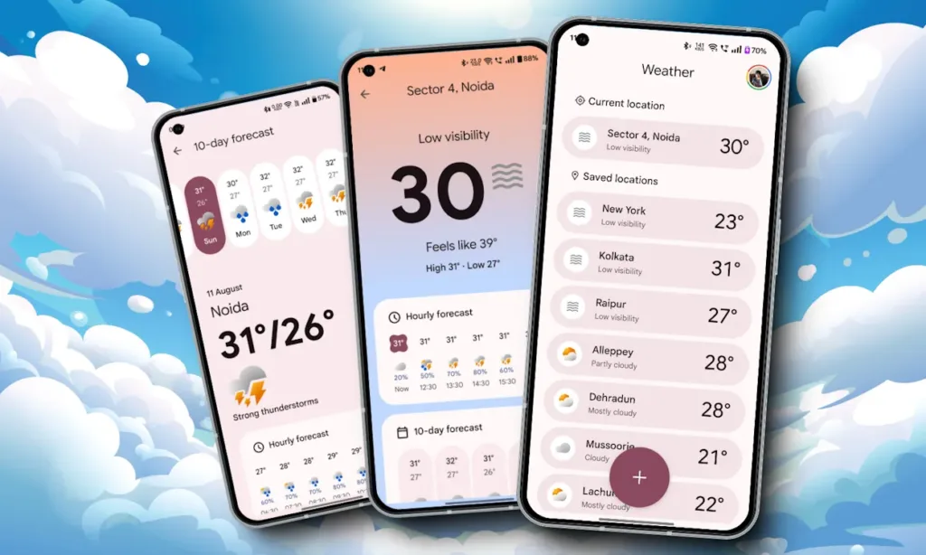
Unlike iPhones, Google’s Pixel phones often leak days before their official release, with hands-on images, renders, and wallpapers frequently surfacing online. Recently, the tech community was abuzz with news that the upcoming Pixel 9 series would feature a brand-new Weather app.
Android Authority’s Kamila Wojciechowska was the first to share screenshots of the app, which appeared to be a redesign. Curious to see the new features for myself, I decided to test it out. With the Pixel 9 launch just a week away, the APK for the new Pixel Weather app became available online. I sideloaded it onto my OnePlus 11R to explore the new weather features, and here’s what I found.
Less Clutter, More Straightforward
For years, Google’s Weather app has been cluttered with unnecessary details. The new version, however, is refreshingly streamlined. It avoids overwhelming you with excessive information and focuses on minimizing distractions, letting you concentrate on what matters most.
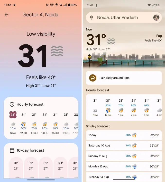
Upon opening the new Weather app, you’re greeted with a much larger font for the temperature, prominently displayed at the top. The degree symbol is omitted, which might seem a bit strange initially, but I quickly got used to it. I appreciated that the app still includes all the essential details—highs, lows, and weather status within easy reach.
The Pixel Weather app avoids bombarding you with excessive details. Instead, it removes distractions to help you focus on what’s truly important.
In the previous UI, you had to scan left and right to gather all the information. That’s no longer necessary with the new app, which offers a much-needed improvement. The updated Weather app now features a gradient background that adjusts according to the weather conditions. In contrast, the old app used solid colors with subtle animations, which have been omitted in the redesign.
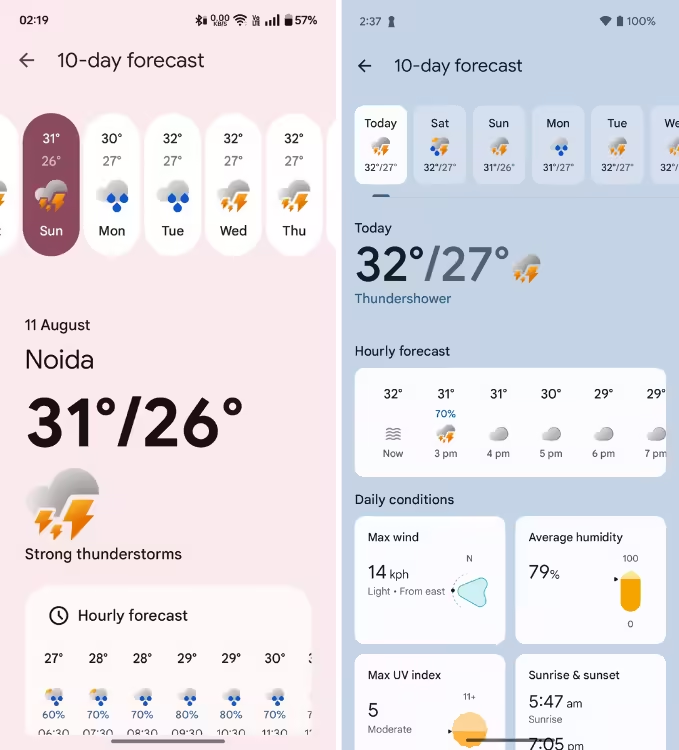
The Hourly forecast, 10-day forecast, and Current conditions panels are still there, but they’ve been expanded and redesigned with the Material You aesthetic. I appreciate that the 10-day forecast now appears as a horizontal list, replacing the previous vertical layout that required more scrolling.
Additionally, the Current conditions text has been removed, leaving only the weather cards, which now fit into circular or squircle dials. The new app also lets you long-press on these weather cards to rearrange them according to your preference, adding a nice touch to the customization options.

The Hourly details are missing from the new app, but honestly, I won’t miss them. I rarely used that feature anyway. The focus on minimalism also carries over to the 10-day forecast info panel.
Although the overall design still has a widget-like feel, key information is now more prominent. For instance, the panels at the top have been reshaped into ovals, and the temperature details underneath have a larger font size.
However, I did notice that you can no longer refresh the 10-day forecast section directly as you could in the previous app. Instead, you need to return to the main page to refresh it, which is a minor inconvenience. While the new Pixel 9 Weather app ensures you don’t miss any crucial information, it’s a small downside to the redesign.
Where’s Our Friendly Neighborhood Froggy?

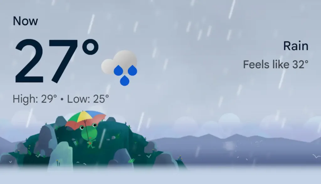
Since its introduction in 2016, the Weather Frog affectionately known as Froggy has been a charming feature of the Weather app. Unfortunately, Froggy is missing from the new redesign. The panel that once showcased Froggy’s adorable weather-related actions and animations is nowhere to be found.
I’ve grown quite accustomed to seeing Froggy, so his absence in the new version is a bit disappointing. However, there’s a glimmer of hope as Wojciechowska mentioned that this is a “non-final” version of the app. Despite this, the new UI seems to offer no space for our froggy friend to return.
I’ve gotten so used to seeing Froggy around that it’s a bit disconcerting to see him unwell in the new version.
Even if Google decided to remove Froggy entirely from the final version, I get why. When you open a weather app, you’re usually just checking if the weather is going to be harsh or pleasant, so extra animations might not be necessary.
However, Froggy did add a bit of charm to what could otherwise be a rather dull experience. So, I’m really conflicted about this decision.
Pixel Weather App: Function Over Form
While the older Weather app had its charm with Mr. Froggy made saving and accessing locations quite cumbersome. The new app has addressed this issue significantly. Now, you can easily add a new location by tapping the plus icon on the Weather home screen, and it’s instantly saved.

You can now access saved locations easily from the home screen, which is a big improvement over the old search method. The new Pixel 9 Weather app features subtle, intuitive changes that make it a better weather app overall compared to its predecessor.
If Google decides to reintroduce Froggy, it would be the perfect touch. Overall, it’s among the top weather apps available. That’s my take on the new Pixel Weather app what do you think? Let us know in the comments below!


