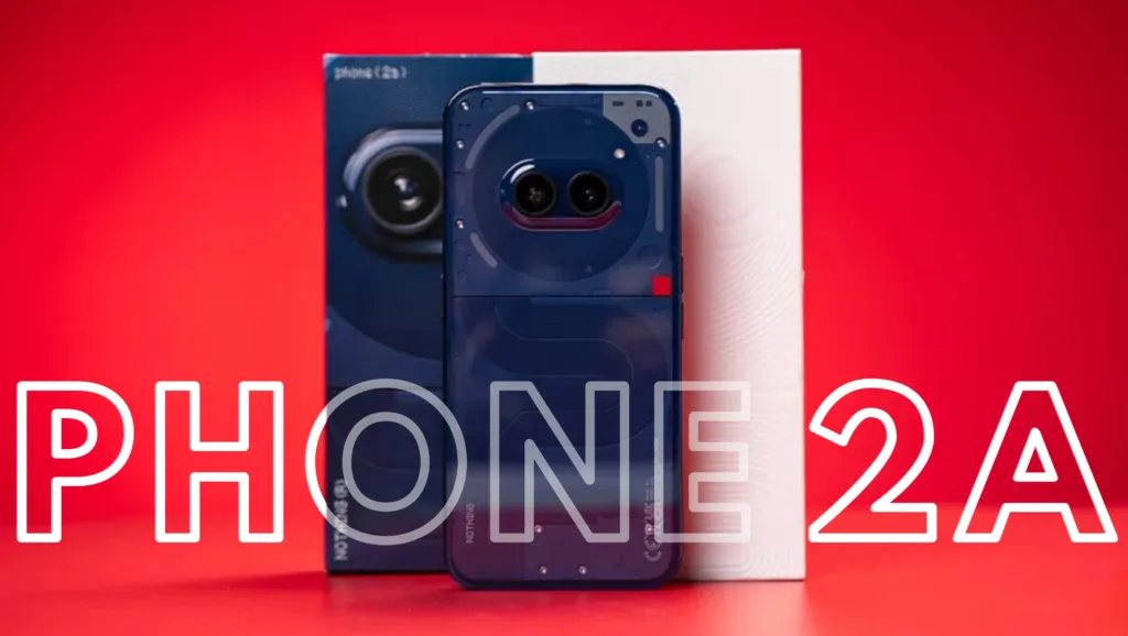
In March 2024, the Nothing Phone (2a) was launched in India, initially available in White and Black color options. During my review of the Phone 2a, I expressed a preference for the White variant due to its accentuated transparent design and overall aesthetic. Now, the brand has introduced a new Blue color variant in India, which I have recently acquired.
This marks the brand’s first expansion beyond the traditional Black and White color schemes. The audio department also received a playful new ‘Yellow‘ color option with the Nothing Ear (a).
Returning to the new Blue Nothing Phone 2a, there have been no changes to the hardware or software. So, does it manage to sway my preference away from the White variant, or is it now the best option for the Phone 2a? With all three color options in hand, I took the opportunity to examine them closely. Here are my thoughts.
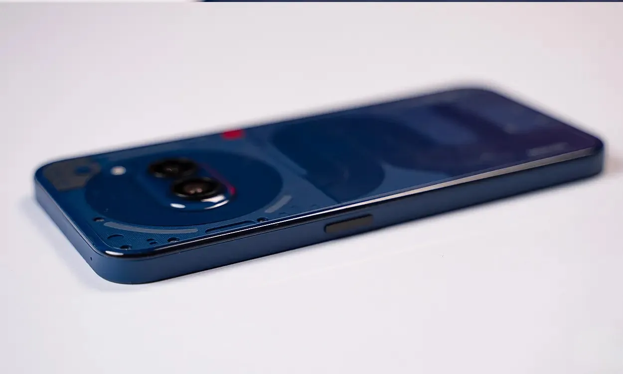
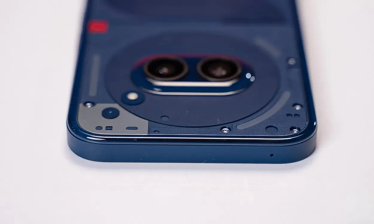
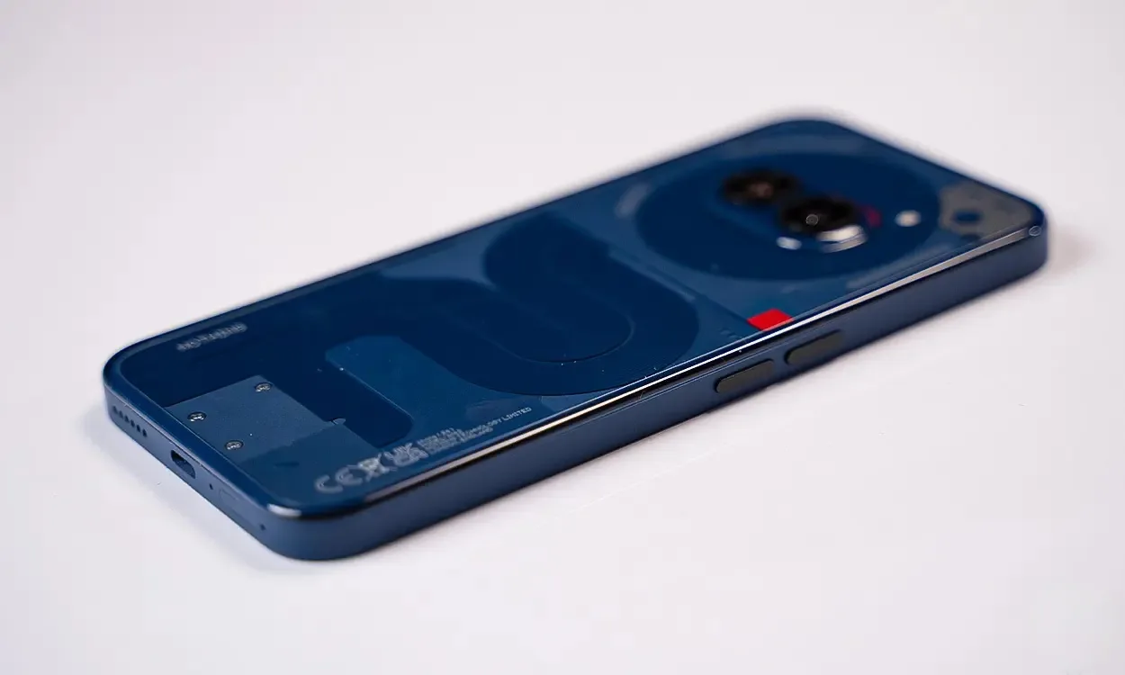
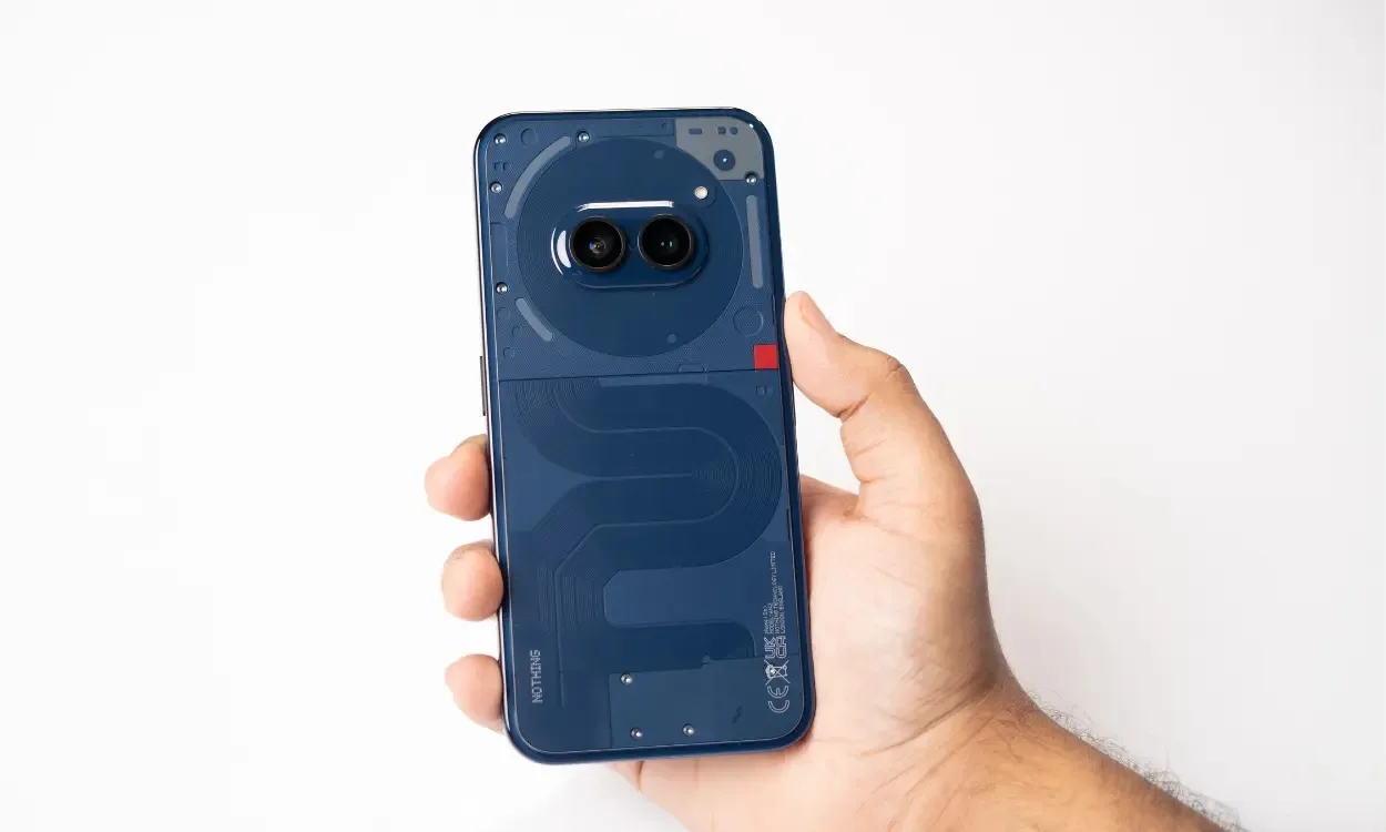
The new Blue Edition of the Nothing Phone 2a features a combination of dark indigo and light ash blue tones, as seen in the photos. The iconic Glyph Interface from Nothing is prominently displayed in its three-striped design, now in the new blue shade.
While the plastic frame is brushed in the same blue shade, Nothing has opted to retain the black volume button and power buttons. This choice doesn’t make them stand out as they do on the white variant, nor do they complement the blue frame as well.
Nevertheless, Nothing’s attention to detail is evident. The branding and CE marking on the Phone 2a’s back are in ash blue (whitish) color, matching the overall theme. Even the screws on the back carry the ash blue tone, demonstrating a commitment to consistency in design.
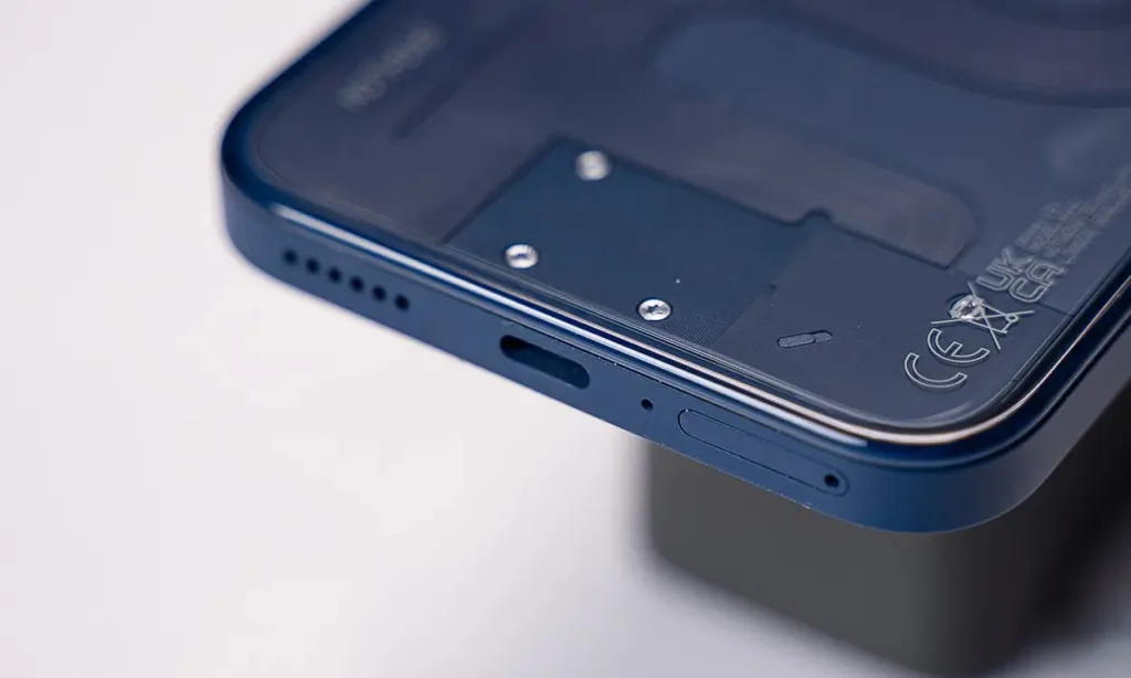
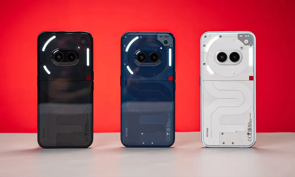
Looking at the other two color variants, they also stay true to their respective themes. What stands out to me about the Blue variant is that, despite being a darker shade, it’s not too dark to obscure the details of the connecting ribbons and other internal components, as is the case with the Black variant. However, the White variant still outshines them all, with the Nothing design standing out beautifully against the white backdrop.
Compared to the Black and White options, the Blue Edition strikes a good balance, fitting in between the two extremes. For a company breaking away from its traditional duotone approach, the color choice may seem somewhat uninspired. Personally, if I had to choose among the three options, I would still go with White, with Blue being my second choice.
Although the hardware specifications were expected to be identical, I conducted a few tests to verify this. The results were quite enlightening, and here are my findings.
Better Display Tuning?
Firstly, I found that the display tuning is better on the Nothing Phone 2a Blue Edition. The display is slightly cooler, which I noticed when viewing a white background in the phone’s settings app.
I carefully checked the display settings on all three color variants, and while they were identical, the visual experience was different. The Blue Edition’s display tones appeared more natural, while the other two devices seemed to boost the warm tones a bit too much. Take a look:
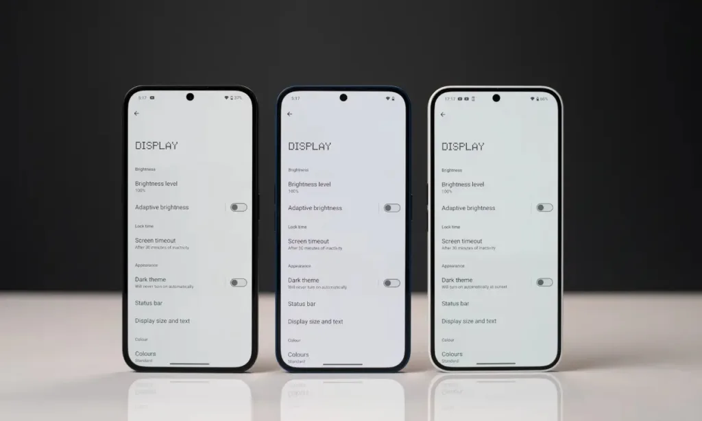
The Blue variant exhibited the best default display tuning among the three. Even whites appeared more pronounced and visually appealing on it. It’s perplexing to see such a significant discrepancy in display performance among three color variants of the same device.
Minor Software Downside (As Of Now)
On the software side, the Blue variant has a slight disadvantage, at least for now. While the other two colorways are up-to-date with Nothing OS 2.5.5, the Blue variant I am using comes with the older Nothing OS 2.5.4.b version out of the box.
As of now, I haven’t received an update. However, based on Nothing’s track record, I believe the newest color variant will soon receive the latest update. Users should receive it right out of the box. For the time being, it misses out on features like the new ChatGPT integration, camera optimizations, and a few other enhancements that come with the Nothing OS 2.5.5 update.
When it comes to choosing a color option, I can’t definitively crown one variant over the others. It’s a very subjective choice, and while the White color option appeals to me more, the Blue variant might be more appealing to others. Overall, the Blue variant is a welcome addition to the lineup of Nothing Phone 2a color options.
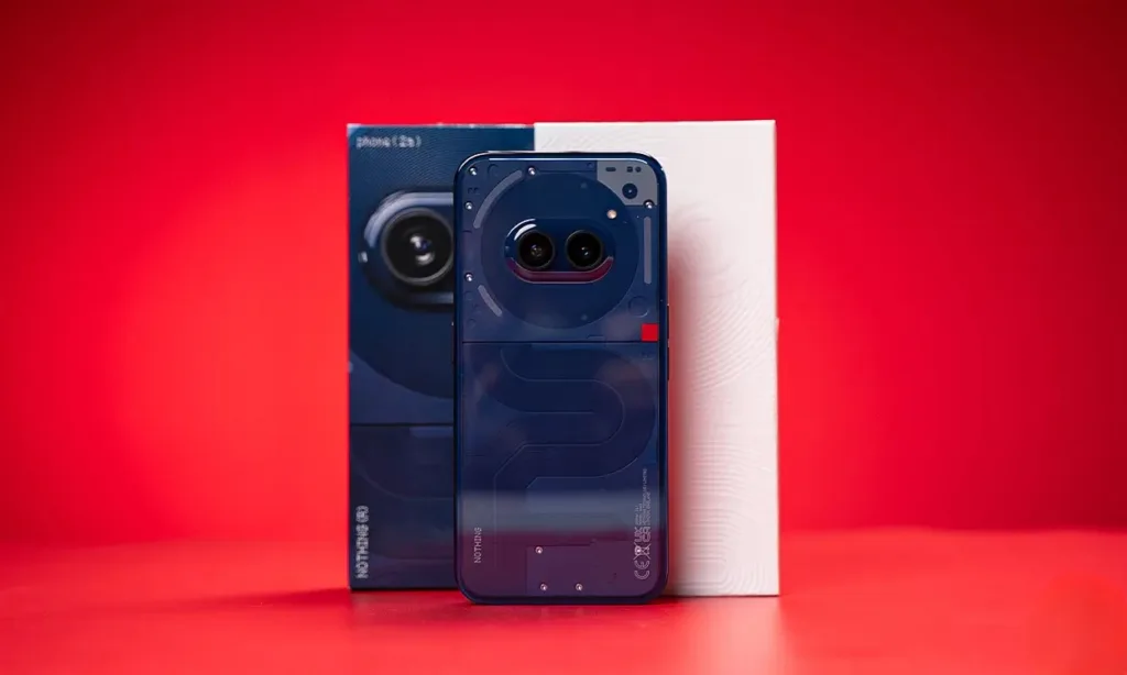
This move highlights Nothing’s departure from its traditional monochromatic designs and its embrace of unique color options, as seen with the yellow Ear (a) and now the Blue variant. Considering Nothing’s sub-brand CMF features a colorful lineup, it’s encouraging to see this vibrant palette extend to the parent company. Perhaps we’ll see more colors from CMF’s rumored first smartphone.
Additionally, the Blue variant will be available in India for Rs. 19,999 as a one-day launch offer starting May 2 at 12:00 PM via Flipkart. If you’re fond of the Blue variant and have been considering the Nothing Phone 2a, this is a fantastic offer you shouldn’t miss.
Are you a fan of the new Nothing Phone 2a Blue Edition? Let me know in the comments below!


