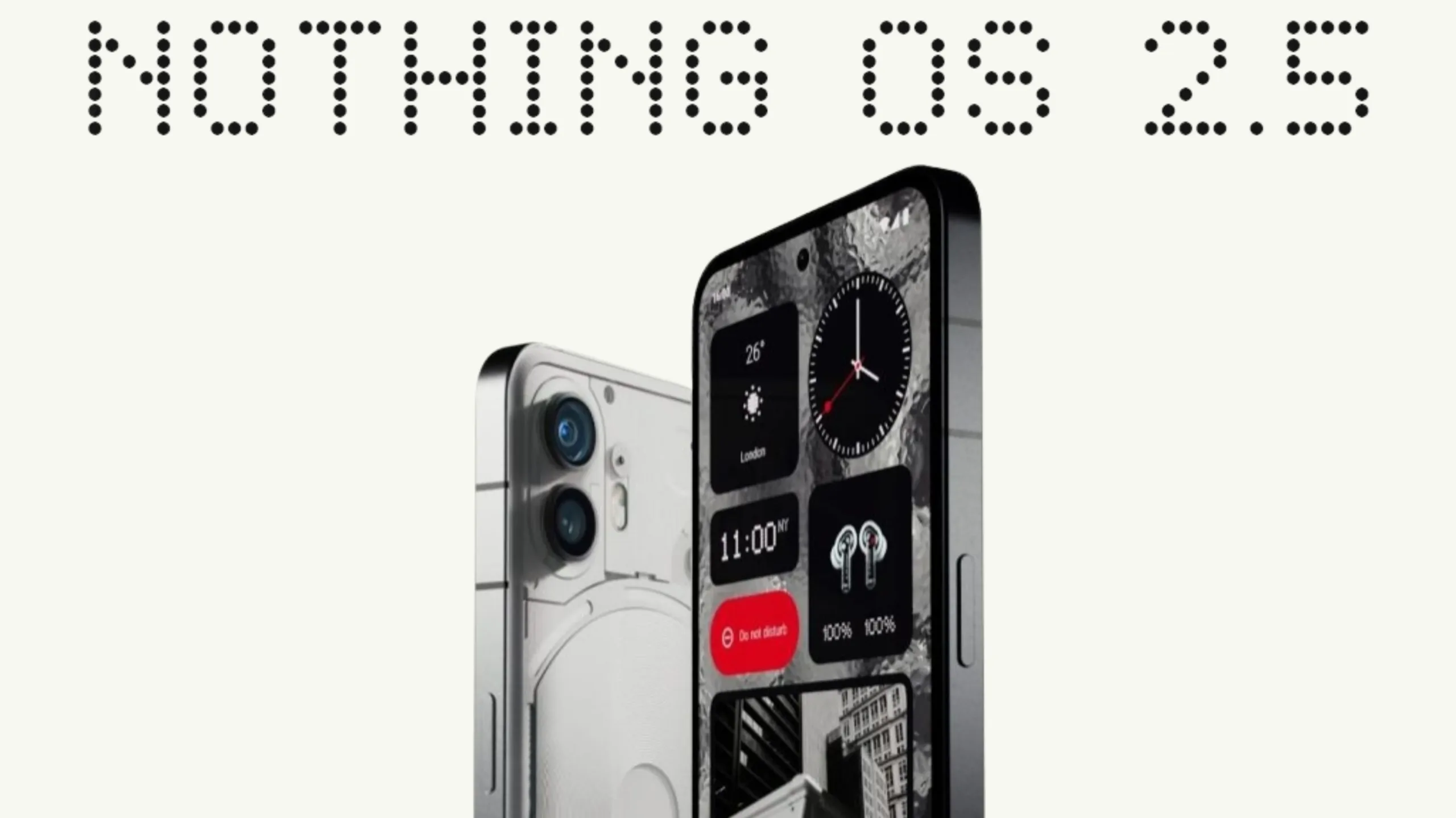
Nothing’s approach to its operating system is commendable. While Nothing OS may not offer all the bells and whistles found in UIs like One UI and Hyper OS, it has evolved significantly from resembling a pure AOSP image to arguably one of the cleanest yet functional user interfaces, akin to Pixel UI. The recent release of Nothing OS 2.5, available in beta for Phone (1) and Phone (2), introduces new features and improvements for a better user experience. However, it is subjective as it misses out on a few features that could enhance the overall experience. Here are some useful features in Nothing OS 2.5 on the Phone (2), along with some shortcomings that Nothing could improve upon.
Nothing OS 2.5 Key Features
Nothing OS 2.5 introduces several key features and improvements for Phone (2), including:
- Revamped Home and Lock Screen Customization Page.
- Glass Wallpaper, Glass effects, and a Monochrome color theme.
- Glyph progress for Google Calendar; The Glyph progress starts five minutes before the event.
- Glyph presets and the ability to access the timer from the lock screen.
- New Glyph animation when using NFC.
- Power button double-press gestures.
- More lock screen shortcuts.
- Three-finger swipe gesture for taking screenshots and a revamped Screenshot editor.
- New Widgets include Media Player, Pedometer, and Screen Time.
Before the stable release, I had been using Nothing OS 2.5 based on Android 14 for a month, and while it may sound cliche, something about Nothing’s Beta channel reminds me of OnePlus. It’s typically very stable with minor glitches here and there. Kudos to the developer team! This review, however, is based on my experience with the stable version for close to two weeks.
Nothing OS 2.5: What I Like
Stability and Performance
There were hardly any glitches or bugs in the Beta version, and this trend continues in the Stable version. Several minor issues present in the Beta, such as the image of Bluetooth devices paired with Fast Pair not showing up in the Quick Settings tile, have been fixed. I haven’t encountered any app crashes or UI glitches yet, making the experience smooth overall.
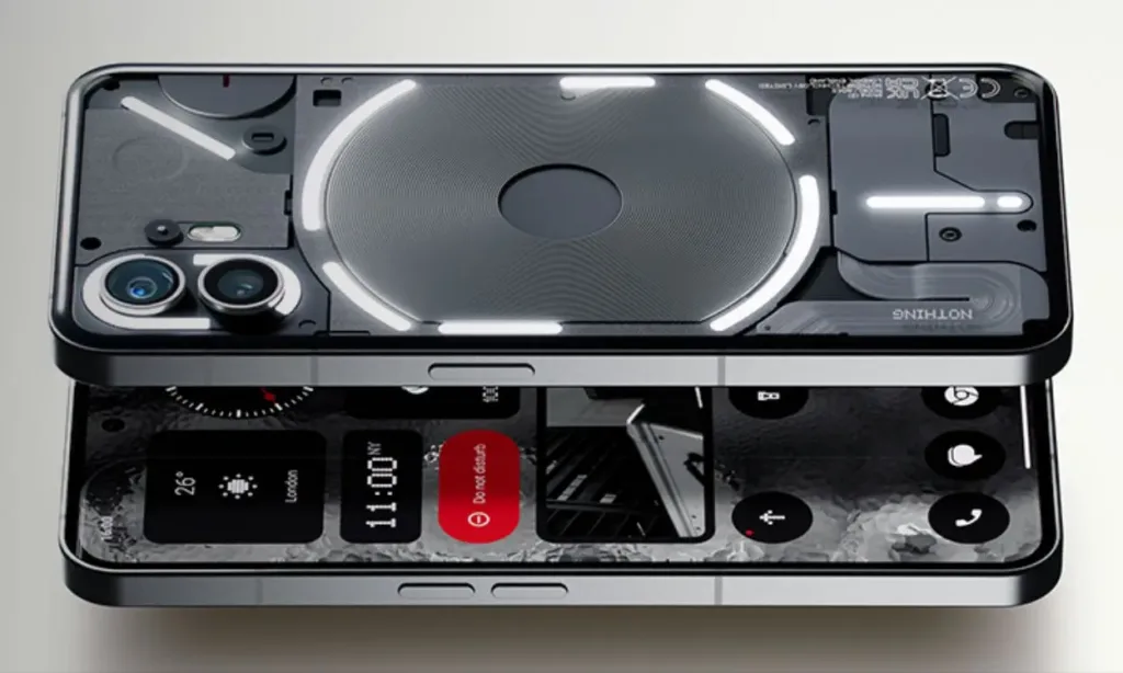
The new widgets function as advertised and remain one of the standout features of the Nothing Phone. It’s a wishful thought that Google would adopt a similar approach in Pixel UI. Widgets are among the best features of Android, and it’s both good and ironic to see Nothing maximizing their potential more than the creators of Android.
In regular day-to-day use, the phone performs excellently, although I haven’t noticed a significant performance boost, likely because the Snapdragon 8+ Gen 1 is already very fast. However, I do observe a slight improvement in smoothness, animations, and app launch speeds, although this could be a placebo effect.
As someone who uses their phone for only 2-3 hours a day, the battery life has been exceptional, easily lasting a day and a half. I appreciate the standby battery drain optimization algorithm of Nothing OS. It doesn’t restrict background apps like OnePlus or MIUI, yet it manages to maintain battery life better than my Pixel 6.
UI Changes
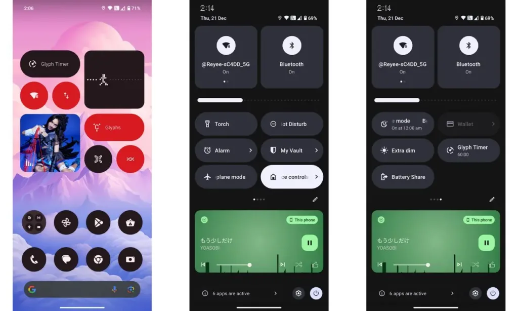
The UI changes in Nothing OS 2.5 are primarily based on Android 14 with Nothing’s customization on top. Additionally, there are new features unique to Nothing OS, such as the Bluetooth menu in Quick Settings, Auto-adaptive icons, and more.
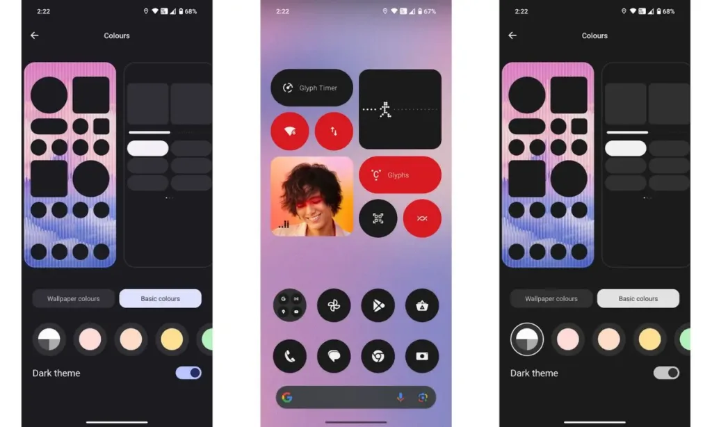
The update introduces two new widgets and additional customization options, which will be discussed shortly. One notable change is the square design of the Wi-Fi and Bluetooth tiles in Quick Settings, replacing the previous circular design. The style of the Brightness slider bar has also been updated.
The main highlights of Nothing OS 2.5 are in the customization section. In addition to the new monochrome color option, two new effects have been introduced: Atmospheric and Glass. The Atmospheric effect applies a Gaussian blur to the wallpaper, creating a panning and zooming effect. On the other hand, the Glass effect adds a filter to mimic the appearance of Nothing’s original wallpapers. Furthermore, users now have the option to choose from additional lock screen shortcuts, such as a QR code scanner and DND mode.
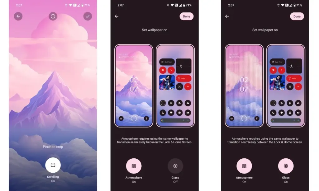
Overall, the Atmospheric filter significantly contributes to the tech detoxification that Nothing aims to achieve. The monochrome widgets help users disengage from their phones more quickly compared to the vibrant Material You icons. I believe Nothing has done well with these improvements in the customization section.
This build has an issue where the Gaming Dashboard doesn’t dynamically refresh the FPS number. There are also some UI padding issues on the lock screen, causing notifications to overlap with lock screen shortcuts.
Another problem I encountered was with the “Atmosphere effect” when using wallpapers set by a third-party app like Backdrops. While the effect requires the same wallpaper on both the home and lock screens for a smooth transition, I had set this up, but the effect only applied to the home screen and not the lock screen. However, the effect worked fine on default wallpapers and those set from Google Photos.
Overall, Nothing’s approach to customization features is subtle yet intriguing. The UI features are practical for regular daily use and unlikely to become boring. However, as a lifelong Android user, I find myself wishing for more of these subtle features. The UI has improved significantly since Nothing OS 1.0, but Nothing still has room for growth.
More Glyph Features
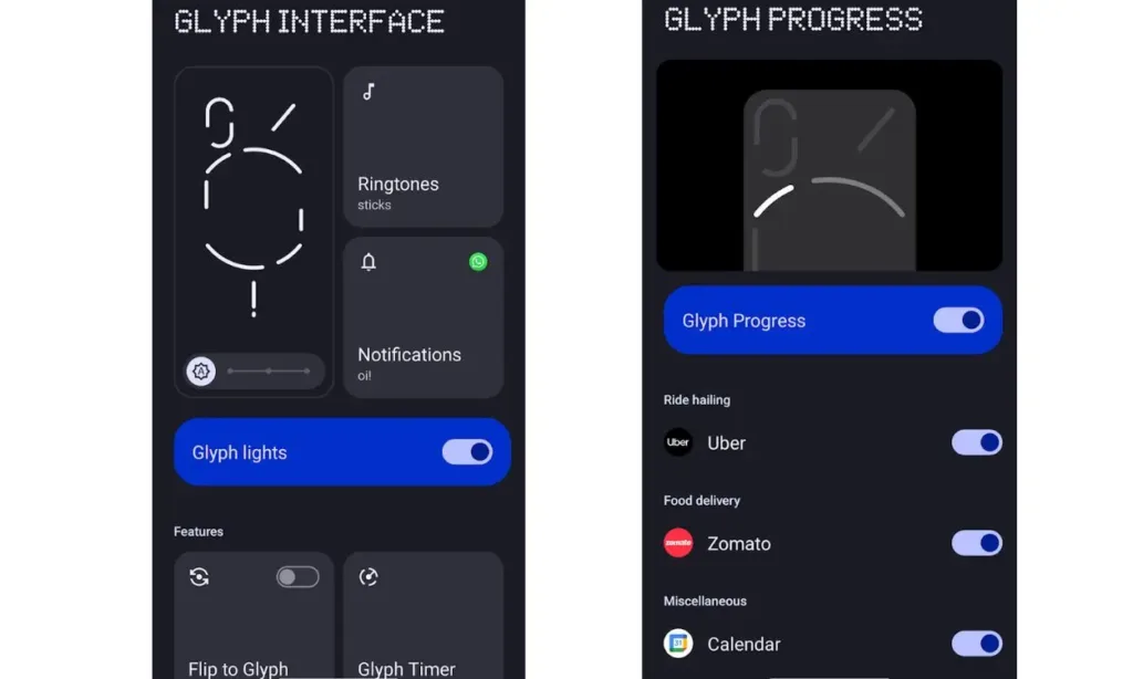
Glyphs are integral to Nothing devices, defining their unique identity. The Phone (2) introduced more addressable LED zones, enhancing the user experience by enabling features like tracking Uber bookings or online food orders on Zomato. With Nothing OS 2.5, Google Calendar joins the list of apps that can utilize the progress LED, and the integration works seamlessly. The timer and LEDs start five minutes before a scheduled event or meeting, adding a neat and practical feature.
Gestures and Other UI Improvements
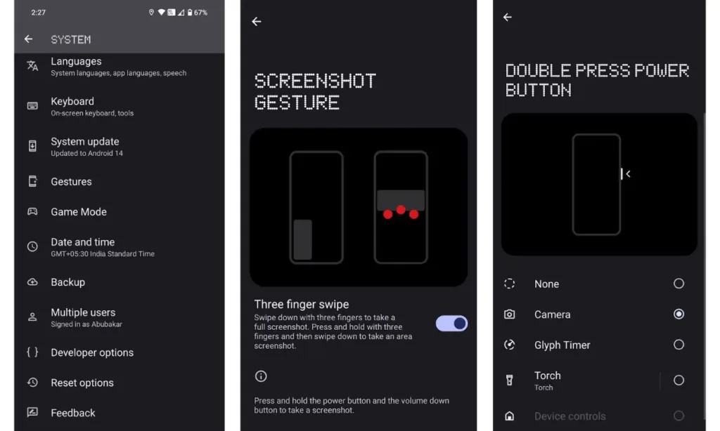
The back gesture arrow is now more aligned with Nothing’s style. The new three-finger screenshot gesture is incredibly useful, as is the improved screenshot editor, which now includes more editing tools like Blur. The attention to detail is impressive, and I appreciate the overall vibe of the UI – it’s clean and enjoyable to use.
Nothing OS 2.5: What I Don’t Like
Lacking Glyph Support for Apps
While the new additions are welcome, I believe Glyphs, particularly Glyph Progress, should support more apps. I understand that this largely depends on whether developers are interested in adding the feature. However, given that it has been some time since the launch of Phone (2), I wish a few more apps were supported.
Lacking Glyph Support for Apps
While I appreciate the new additions, I believe Glyphs, particularly Glyph Progress, should support more apps. I understand that this largely depends on developer interest in adding the feature. However, given that some time has passed since the launch of Phone (2), I wish a few more apps were supported.
Limiting Widgets to the Home Screen
I was surprised to discover that the new Pedometer and Media Player widgets cannot be added to the lock screen. Both widgets could be beneficial, as users wouldn’t need to unlock their phones to check the progress indicated by the stick figure or access a new media player UI on the lock screen. It’s worth noting that the existing default media player can be disabled in the Settings.
Limited Glyph Integration
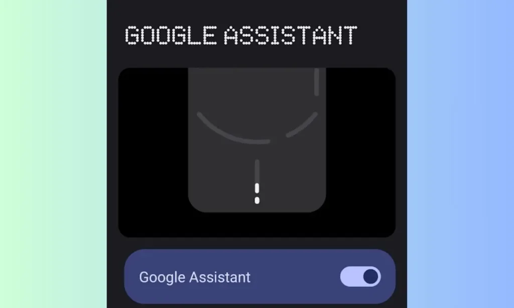
The integration of Assistant’s response with Glyphs is cool, but I wish Glyphs also synced with the Google Clock timer, or if the Assistant allowed users to set a Glyph timer. The former should be possible, as Google Clock creates a dynamic notification for a timer once you ask the Assistant to set one. Nothing could potentially take the values from the same API and incorporate them into their Glyphs API.
Nothing OS 2.5: Suggestions and Feedback
There are a few subjective suggestions that Nothing could consider to further enhance the user experience.
Widgets Need More Integration
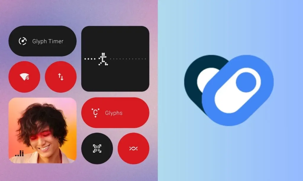
The Pedometer widget is useful, but it would be even better if Nothing integrated it with Health Connect. The second and third pages of the widget display the seven-day average and a calendar with all your progress for the month. Integration with Health Connect could allow users to sync their previous steps and progress in the widget.
For those unfamiliar, Health Connect by Google stores all health and fitness information in one place. It allows supported health apps to sync progress and provides more control over which stats you want to share.
Health Connect could also enable Nothing to develop other health widgets, such as calories burned and sleep tracking. I would personally appreciate a native Health app in Nothing’s app ecosystem, and hopefully, the development of a dedicated Nothing WearOS smartwatch.
Independent Expanding Notifications
A minor annoyance I have with Android is that when you expand a notification on the lock screen using the arrow, it opens the Quick Settings page to expand the notification instead of just showing the contents of the notification. What’s more frustrating is that the Quick Settings panel doesn’t shrink back when you click on the arrow to close the notification. It would be great if Nothing could improve this, similar to how they enhanced the Bluetooth quick settings.
Other Glyph Integrations
Another feature I hope Nothing adds in the future is tap gestures for Glyphs when flip-to-Glyph is enabled. Allowing users to set double-tap for “Next track” and triple-tap for “Previous track” would eliminate the need to pick up the device, turn it on, and tap next. They could also include a visually appealing Glyph animation where the light slides to the right or left depending on whether the user taps twice or thrice.
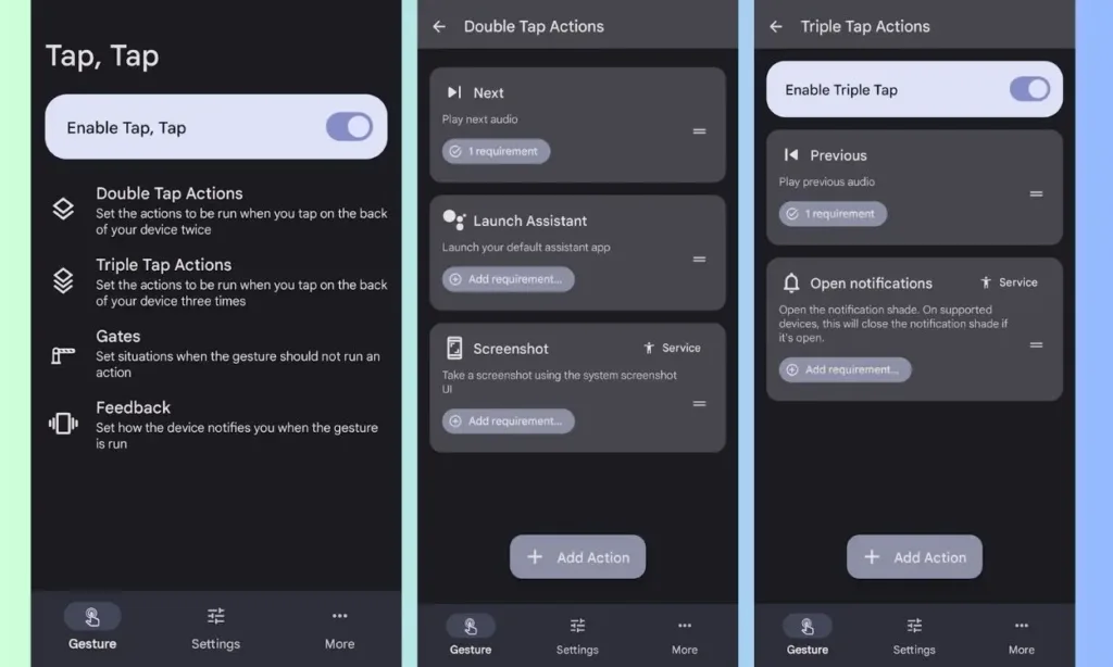
It’s not impossible! There’s already an app called TapTap, developed by the same team behind Smartspacer. It works seamlessly whether the screen is on or when the device is locked. However, I couldn’t get the gestures to work when the phone was facedown flat on the table with the Flip-to-Glyph feature enabled or disabled, even after using the “Gates” feature, which adds exceptions.
The Android 14-based Nothing OS 2.5 update stands out as an impressive release. It introduces features and significant improvements that perfectly align with Nothing’s minimalist approach. Over the past few months, the company has integrated numerous useful features while maintaining a clean and fluid user experience. This achievement is particularly commendable for a company in its early stages.
It was a clever and sensible move on their part to prioritize the addition of much-requested features such as App Hide, App Cloning, and App Lock, which are undoubtedly among the most important features to have. As a Pixel user, I find myself missing these features, and I hope Google is taking note. I’m eagerly anticipating what Nothing has in store for its users in future OS updates.


