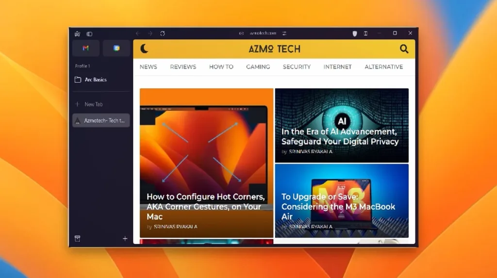
I recently gained access to the highly anticipated Arc browser on Windows 11, which is currently in beta testing. Despite not having all features available yet, I dove in to explore what sets Arc apart as a unique browser. As a dedicated Google Chrome user, I was particularly excited to try a new browser that offers a fresh web browsing experience.
Arc’s UI is Beautiful
Upon launching the Arc browser, the first thing that strikes you is its beautiful UI. The Mica-polished window and title bar are reminiscent of Windows 7’s Aero design, while the frosted glass corners feature an acrylic translucent blur that enhances the overall look.
In a departure from other browsers, Arc combines the title bar and address bar to create a unified user interface. All controls and menus are located on the left sidebar, which can be collapsed to expand the screen further. While I’m not sure if I like this layout, it does allow me to focus more on the content or website open in the browser. Additionally, the design is quite minimal, with fewer buttons or extension icons cluttering the interface.

In the Windows version of Arc, the address bar is centered and cannot be hidden. However, on macOS, the address bar is integrated into the left sidebar. This means that when the sidebar is collapsed, users get a cleaner look and more screen space. I hope Arc will offer Windows users the option to choose their preferred layout in the future.

Lastly, the themes in Arc add a colorful and playful touch to the browser. You can select a color for each space (more details on this below), and it’s applied uniformly throughout the entire UI. Additionally, there are different color variations available for both light and dark themes, which I personally appreciate.
A Fresh Perspective on Web Browsing
Arc may require novice users to spend some time navigating and learning its unique features. It offers a different approach to web browsing compared to traditional browsers like Chrome or Edge. Arc features a vertical tab navigation system where users can organize their favorite websites, bookmarks, folders, and most notably, Spaces.
Spaces can be likened to virtual environments, seamlessly integrated into a single window. Users can easily switch between Spaces with a simple two-finger swipe, allowing access to different user profiles with separate account logins within each Space.

For instance, you could have all your personal and entertainment-related items in one Space, and then seamlessly transition to your work environment with a simple swipe. The shift between Spaces is elegantly executed in Arc, and I particularly appreciate how the theme changes based on the active Space.
Additionally, instead of a traditional new tab, Arc features a Command Bar where you can search or enter a website URL. You can also bookmark websites, which are conveniently displayed in the left sidebar, and organize them into folders. Furthermore, Arc offers an auto-archive feature that archives all your recently closed and unpinned tabs.

This feature helps keep your sidebar clean and uncluttered. If you need to revisit a specific tab after a research session, you can easily find it under the archive button. Additionally, Arc’s split view functionality is fantastic, allowing you to split tabs into four windows. So, there is no shortage of features here. Arc has all the basics pinned down.
Features Missing on Arc’s Windows Version
As previously mentioned, the Windows version of Arc is currently in beta testing, and many of its headline features are not yet available. I am eagerly anticipating features such as Arc Boosts, which allow customization of any website, Arc Max for exploring all integrated AI features, Peek Preview, and more.

I’m especially excited about the site search feature, which enables users to ask descriptive questions by pressing “Ctrl + F“. The Arc browser then utilizes AI to find instant answers from the active webpage. It’s a fantastic way to integrate AI, isn’t it?
Closing Thoughts: Is Arc a Replacement for Chrome on My Windows PC?
While the Arc browser shows a lot of promise and has the potential to disrupt the market, I am reserving final judgment until all features are available on the Windows version. It’s exciting to see revolutionary new ways to interact with the web after so many years.
That being said, performance is a crucial factor for users, and in this regard, Chrome excels. In my experience, Arc was a bit slow to respond on Windows 11. Arc has been developed in Swift for Windows, which according to CEO Josh Miller, is the “most controversial decision to-date!” Most browsers are developed in C++, so there may be performance overhead.
In conclusion, while the Arc browser may not be the Chrome alternative everyone has been waiting for, it certainly deserves recognition in its own right. For now, I’ll stick with my reliable Chrome browser and observe how Arc’s development on Windows progresses. Have you had a chance to try the Arc browser?


