Nearly 28 years since its debut, the Grand Theft Auto (GTA) series has continued to evolve while staying true to its original identity and that’s clearly reflected in the evolution of its iconic logo. As fans eagerly await the release of GTA 6, Rockstar Games has already revealed the official logo in the 2023 trailer, sparking excitement across the gaming community. In this article, we’ll take you on a visual journey through the history of the GTA logo from the pixelated design of GTA 1 to the bold, neon-inspired look of GTA 6.
The Grand Theft Auto (GTA) logo has evolved steadily over nearly three decades, reflecting the growth and changing style of the franchise. The newly revealed GTA 6 logo blends nostalgic elements from the iconic Vice City era with a fresh, modern design. Recently, Reddit user NateSnape shared a complete visual timeline of every Grand Theft Auto logo, including the latest addition from the GTA 6 trailer.

However, the iconic logo style that fans recognize today wasn’t always the same. Over the years, Rockstar Games has experimented with different designs and aesthetics. In the list below, we’ve covered every GTA logo in chronological order, showing how the Grand Theft Auto logo has transformed with each new release.
1. Grand Theft Auto
- Release date: November 28, 1997
- Platform(s): PC, PS1, Game Boy Color
The very first Grand Theft Auto logo was simple yet effective, perfectly capturing the chaotic spirit of the franchise. Featuring a fiery yellow and orange color scheme, the design reflected the game’s focus on action, rage, and speed.
The small stars included in the logo symbolized the crime counter a mechanic that would later become an iconic part of every GTA game. This logo marked the beginning of what would become one of the most influential and recognizable franchises in gaming history.
2. GTA: London 1969 and 1961
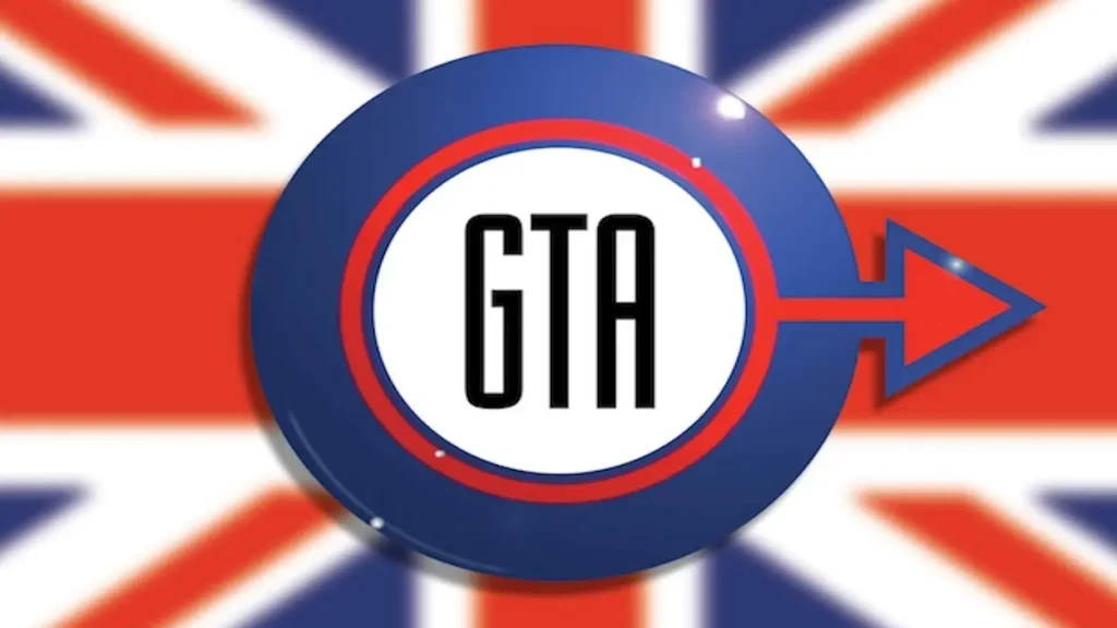
- Release date(s): April 30, 1999; June 1, 1999
- Platform(s): PS1, PC
The GTA London games are well-known for showcasing the city’s 1969 and 1961 eras, bringing a unique British touch to the franchise. To reflect this, Rockstar Games incorporated the colors of the British flag red, white, and blue into the circular design of the logo.
Contrary to what some may think, the circle wasn’t meant to symbolize running in circles within the game world. While the GTA London logo deviated from the classic GTA style, it still left its mark and added a fresh, regional flair to the series.
3. Grand Theft Auto 2
- Release date: October 22, 1999
- Platform(s): PC, PS1, Game Boy Color, Dreamcast
By the time Grand Theft Auto entered its second year, the franchise had already experimented with three different logo designs. The GTA 2 logo, however, kept things simple and minimalistic. Unlike the game’s promotional poster which stood out thanks to the iconic yellow taxi the logo itself felt rather plain and lacked the bold personality that later GTA logos would become known for.
4. Grand Theft Auto 3
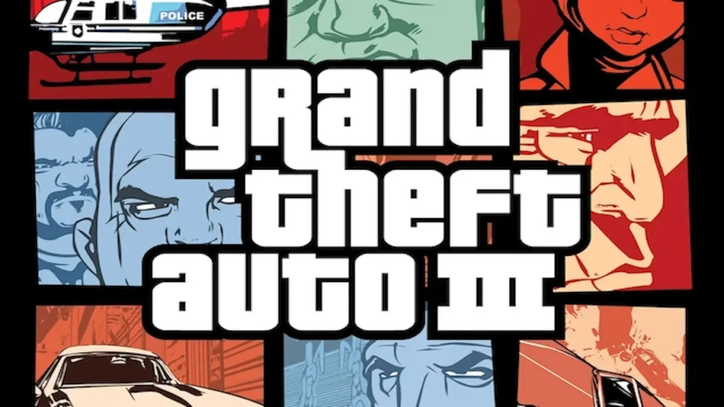
- Release date: October 23, 2001
- Platform(s): PS2, PC, Xbox, iOS, Android
As Rockstar Games stepped into the 2000s, it was clear that the Grand Theft Auto franchise was evolving rapidly and it needed a logo to match. With the release of GTA 3, the series introduced the now-iconic Grand Theft Auto font that would become a staple of the brand.
This was also the first time Rockstar used Roman numerals ‘III’ instead of ‘3’ a style choice that has remained consistent in all major GTA titles since. Paired with a bold square grid design, the GTA 3 logo marked a turning point, giving the franchise a strong and recognizable visual identity.
5. GTA: Vice City
- Release date: October 29, 2002
- Platform(s): PC, PS2, Xbox, iOS, Android
Before GTA 3 received a direct sequel, Rockstar Games treated fans to two unforgettable titles Vice City and San Andreas. The GTA Vice City logo perfectly captured the vibrant nightlife and flashy aesthetic of 1980s Miami, featuring a stylish neon-pink script that became iconic. This design left such a lasting impact that Rockstar revisited the neon-inspired style in the recently revealed GTA 6 logo, paying homage to Vice City’s timeless vibe.
6. GTA: San Andreas
- Release date: October 26, 2004
- Platform(s): PC, PS2, Xbox, PS3, Xbox 360, iOS, Android
GTA San Andreas, on the other hand, took heavy inspiration from Los Angeles and West Coast culture and its logo reflected that perfectly. It retained the classic Grand Theft Auto block text, but introduced a distinctive, tattoo-style Diploma Regular font for the “San Andreas” name. This design choice captured the raw, gritty, and rebellious vibe of the game’s story and setting. The same font style was also used throughout the game’s main menu and in-game elements, making it one of the most recognizable logos in the entire GTA franchise.
7. Grand Theft Auto Advance
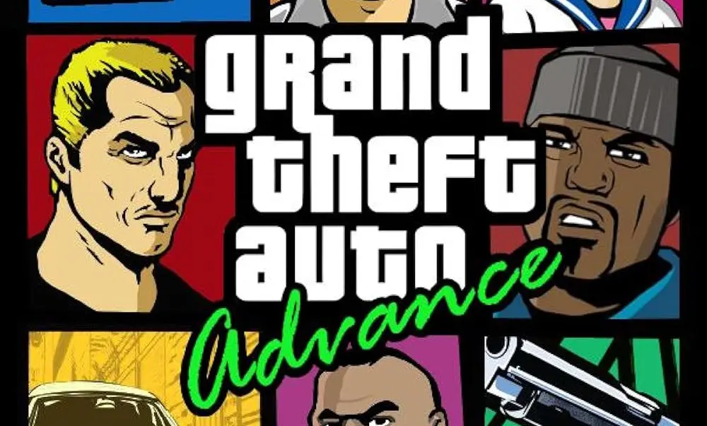
- Release date: October 26, 2004
- Platform(s): Game Boy Advance
The GTA Advance logo stands out as one of the more unique yet forgettable designs in the series. While Rockstar Games kept the classic Grand Theft Auto text, they added a green, cursive “Advance” beneath it to highlight its exclusivity for the Game Boy Advance. However, compared to other GTA logos, this one lacked the bold personality and impact fans had come to expect. As a result, it’s often seen as one of the less memorable entries in the franchise’s visual history.
8. GTA: Liberty City Stories
- Release date: October 24, 2005
- Platform(s): PSP, PS2, Android, iOS, Fire OS
Although Liberty City Stories was a side-quel to GTA 3, it didn’t fall short when it came to engaging storytelling and visual appeal. The logo featured the classic Grand Theft Auto text, accompanied by a bold red “Liberty City Stories” banner beneath it. The choice of red symbolized the crime, violence, and chaos that defined the game’s narrative. Additionally, the logo was often paired with a painted pastel art style that gave the game a distinct, stylish look, making it stand out among the franchise’s spin-offs.
9. GTA: Vice City Stories
- Release date: October 31, 2006
- Platform(s): PSP, PS2, PS3
The Vice City Stories logo was essentially a modified version of the iconic GTA Vice City logo. It retained the signature neon-pink cursive font, preserving the vibrant, retro aesthetic that fans loved. However, while the logo’s style stayed the same, the game itself offered a fresh perspective on Vice City, exploring new storylines and characters. This title also marked the end of Rockstar’s 3D-era GTA games, as the franchise was about to transition into the HD era with its next major release.
10. Grand Theft Auto 4
- Release date: April 28, 2008
- Platform(s): PS3, Xbox 360, PC
With the start of the HD era, the GTA 4 logo introduced a noticeable visual upgrade. The classic Grand Theft Auto text now featured subtle gray shading within its white letters, giving it a more polished and modern look. Staying true to the series’ style, Rockstar used the Roman numeral “IV” instead of the number 4. Interestingly, the black color of the “IV” hinted at the game’s darker, more serious narrative, setting the tone for a grittier chapter in the Grand Theft Auto franchise.
11. GTA 4: The Lost and Damned
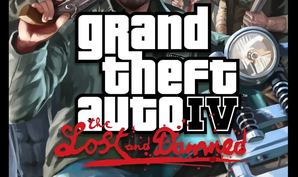
- Release date: February 17, 2009
- Platform(s): Xbox 360, PC, PS3
Rockstar Games carried forward the dark and gritty theme with GTA 4’s DLCs The Lost and Damned and The Ballad of Gay Tony. While both DLCs share a combined logo featuring a Liberty City silhouette, their individual logos stood out with unique design elements. For The Lost and Damned, Rockstar used a rough, handwritten-style font with crimson red blood splatters, perfectly matching the DLC’s violent and chaotic storyline. Interestingly, this was also the first time the developers kept the Roman numeral “IV” from the base game’s logo intact, reinforcing that these stories were part of GTA 4’s universe.
12. GTA: Chinatown Wars
- Release date: March 17, 2009
- Platform(s): PSP, Nintendo DS, iOS, Android
Although GTA Chinatown Wars is connected to GTA 4’s universe, it was released as a standalone game and needed to establish its own identity. This was mainly because its top-down gameplay style differed significantly from the HD visuals of GTA 4. To reflect this change, Rockstar designed a logo using traditional Asian-style fonts, perfectly matching the game’s tone and setting. The stylized typography also complemented the story of the game’s protagonist, Huang Lee, and added an authentic touch to the overall presentation.
13. GTA 4: The Ballad of Gay Tony
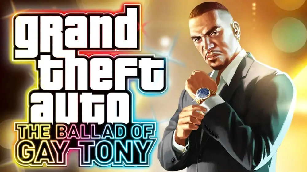
- Release date: October 29, 2009
- Platform(s): Xbox 360, PC, PS3
The second DLC for GTA 4, The Ballad of Gay Tony, took a completely different direction from the dark and gritty tone of the base game. Instead of sticking to the monochrome, crime-filled aesthetic, this expansion embraced a vibrant, colorful theme. The logo featured a neon-inspired design with a bright, multi-colored border, breaking away from the classic black outlines seen in previous titles. This shift in style perfectly reflected the DLC’s focus on nightlife, luxury, and high-energy chaos in Liberty City.
14. Grand Theft Auto 5
- Release date: September 17, 2013
- Platform(s): PS3, PS4, PS5, Xbox 360, Xbox One, Xbox Series X|S, PC
If you haven’t seen the GTA 5 logo by now, you’re probably new to the gaming world. For over a decade, this iconic logo has become one of the most recognizable symbols in gaming history. Unlike previous titles, Rockstar didn’t just use the Roman numeral “V” they cleverly embedded the word “FIVE” inside it.
The design of the “V” is styled to resemble a dollar bill, perfectly aligning with GTA 5’s money-driven storyline and themes of wealth, crime, and power. Without a doubt, the GTA 5 logo is one of the cleanest, most polished, and most memorable logos in the entire franchise.
15. Grand Theft Auto Online
- Release date: October 1, 2013
- Platform(s): PS3, PS4, PS5, Xbox 360, Xbox One, Xbox Series X, PC
In 2013, alongside GTA 5, Rockstar Games launched GTA Online, initially using the classic Grand Theft Auto font for its logo. As the game’s online community exploded in popularity giving rise to trends like GTA 5 RP, custom servers, and modding Rockstar realized the massive potential of this multiplayer world. Over time, they subtly refined the GTA Online logo, adding more visual depth and polish while keeping the signature red “Online” text intact. This simple yet effective design has become synonymous with one of the most successful online gaming experiences ever created.
16. GTA: The Trilogy – The Definitive Edition
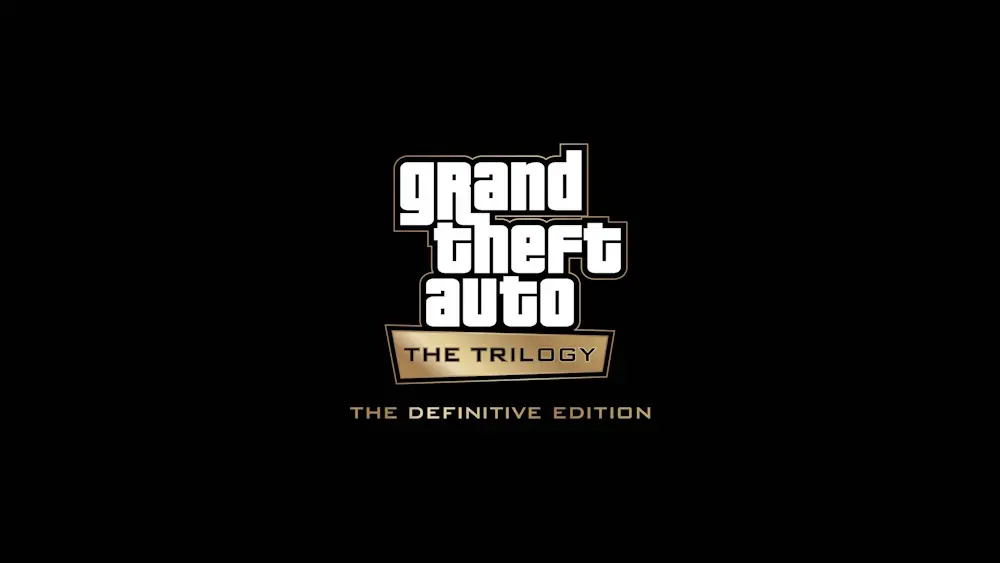
- Release date: November 11, 2021
- Platform(s): PC, PS4, PS5, Xbox One, Xbox Series X|S, Nintendo Switch
When Rockstar Games announced the GTA Trilogy: The Definitive Edition, the reaction from fans was mixed. Many were disappointed, mainly because they were eagerly waiting for news about GTA 6. However, one thing that did catch everyone’s attention was the Trilogy’s logo. Featuring the classic Grand Theft Auto font with a sleek gold border, the logo added a premium feel to the nostalgic collection. For many long-time fans, it was tempting to revisit the classics unless, of course, they had already experienced the original games in order.
17. Grand Theft Auto 6
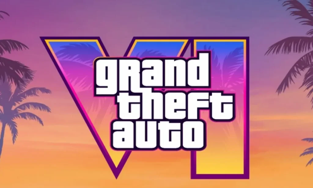
- Release date: Fall 2025
- Platform(s): PS5, Xbox Series X|S
And finally, we arrive at the long-awaited reveal the GTA 6 logo. Rockstar Games unveiled the logo at the end of the game’s first official trailer, instantly sparking conversation across the gaming community. While it took some fans a little time to warm up to the new design, the logo perfectly reflects the game’s theme. Staying true to the franchise’s style, the logo features the classic Grand Theft Auto text, but this time, it’s backed by a bold, neon-style “VI” a clear nod to the vibrant, electric vibes of Vice City and beyond. The design beautifully blends nostalgia with a modern twist, setting the stage for GTA 6’s next chapter.
Additionally, the GTA 6 logo features subtle elements like coconut trees within the background, further enhancing the beachside, tropical vibe showcased throughout the game’s trailer. This small but impactful detail ties directly into the nostalgic essence of Miami-inspired Vice City, which makes its grand return in GTA 6.
And that wraps up the complete evolution of the GTA logos over the last 27 years. From pixelated beginnings to sleek neon designs, the franchise’s logo has grown alongside its legacy. So, what do you think is the GTA 6 logo your favorite so far? Let us know in the comments below!


