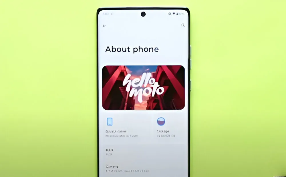
For years, Motorola has been praised for maintaining its near-stock Android MyUX skin. However, the brand recently decided to make a change and introduced what they call Hello UI. This new skin was launched with the Moto Edge 50 Pro just last month. Curious to see how it performs, I decided to test the new skin, especially since we already have the device. Is it the new king of Android skins, or just an unnecessary redesign? Let’s discover more in this review of Moto’s Hello UI.
Bloatware-Free UI but with Ads
Upon turning on the device, you are greeted with a lock screen-like boot animation displaying a very aesthetic “hello moto.” Initially, I thought the phone had booted directly to the lock screen. Moto’s decision to highlight the new UI’s features right from the boot screen is commendable.
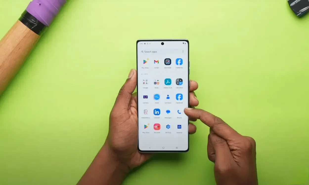
Recently, while Xiaomi moved from MIUI to HyperOS, it didn’t reduce bloatware at all. You still encounter an ad-infested UI, even on premium models like the Xiaomi 14. In contrast, Moto has retained its bloatware-free nature, with only Facebook and LinkedIn pre-installed. Fortunately, you can uninstall these apps.
The rest of the apps are either Moto or Google apps. Aside from a few Moto-specific apps, the other apps are useful and shouldn’t be considered bloatware.
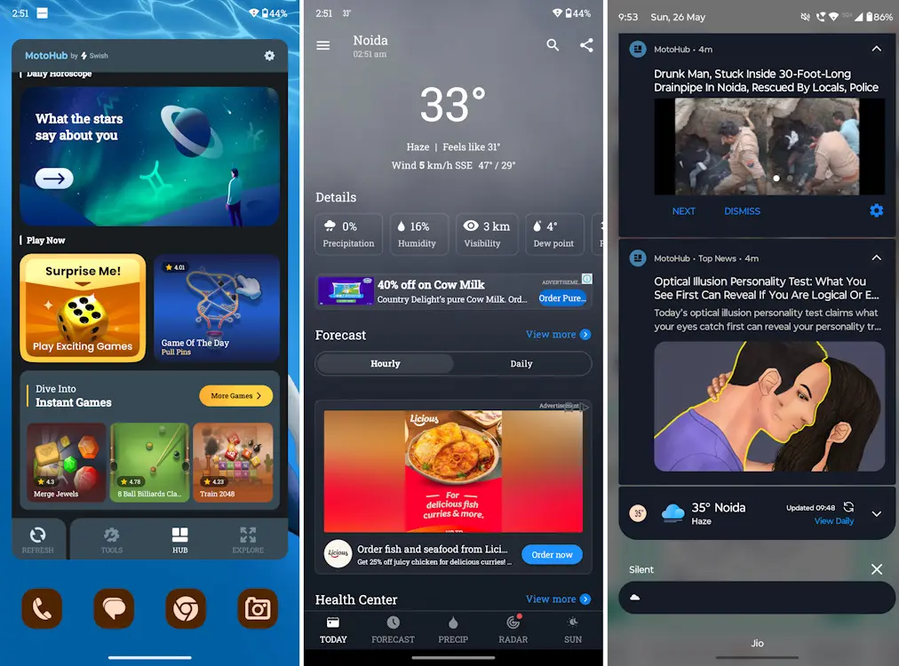
While the new UI offers a mostly bloatware-free experience, the presence of ads is quite annoying. For instance, the pre-installed Weather App, which can be deleted, is packed with ads. The heavy ad load makes the app feel very jittery and slow, so I’d recommend removing it first. Secondly, there’s the Moto Hub, which is essentially a hub for unattractive ads and questionable app recommendations.
There’s also a Moto Hub home screen widget that comes preloaded and displays ads. Additionally, Moto Hub bombards you with unappealing notifications, making it the second thing you’d want to force stop since it cannot be uninstalled.
If you’re wondering, yes, the older MyUX skin had this issue as well. While not as irritating as the HyperOS ads, the MyUX skin still had a considerable amount of ad spam.
A New App to Help You Unplug from Digital Insanity
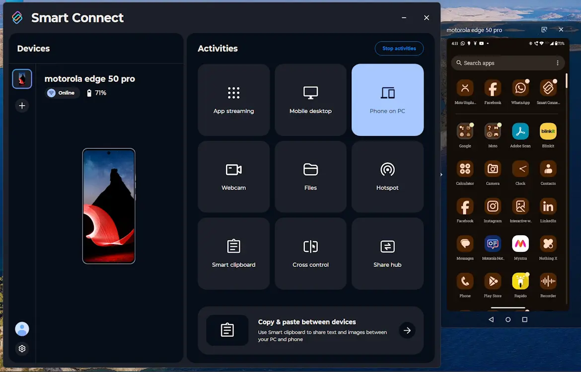
Hello UI retains essential Moto applications like Smart Connect (formerly known as Moto Ready For), which is a great feature. This single app allows you to create your personal ecosystem with any tablet or PC. With capabilities like clipboard and notification sync, app streaming, file sharing, and even turning your phone into a PC webcam, Smart Connect is easily my favorite Moto app.
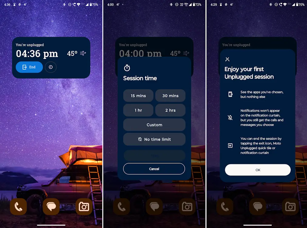
Additionally, this time you get a new app called Moto Unplugged. It’s a blend of DND and Zen Modes, designed to help you disconnect and enjoy your surroundings without constantly checking your phone. In this mode, only the apps you permit will be accessible.
Additionally, you can either set a duration for this mode or choose to leave it open-ended, allowing you to manually exit whenever you wish.
Hello UI Is Prettier and More Intuitive
Several differences which I noticed between Moto Edge 40 Neo and the Edge 50 Pro’s new Hello UI as follows:
Better-Looking Control Center
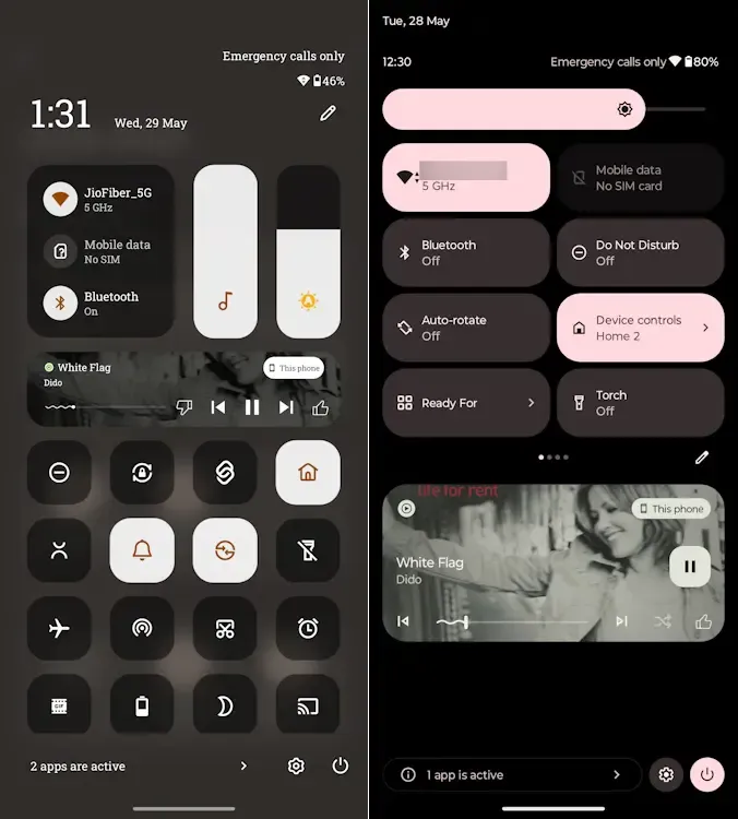
Firstly, the new Control Centre UI in Hello UI draws inspiration from iOS, OxygenOS, and HyperOS, resulting in a significantly improved look. The semi-transparent Control Centre with background blur is a definite visual upgrade.
The icons are much more organized and free of letter clutter, which I prefer. However, users unfamiliar with the icons’ meanings might need some time to get accustomed to them.
I appreciate how the Wi-Fi, mobile data, and Bluetooth device panels are neatly aligned at the top left corner. Next to these panels are the brightness and volume sliders, aligned vertically. The attention to detail in this layout is impressive.
For example, the brightness slider includes an integrated auto-brightness button, allowing you to toggle it on instantly. This saves you the hassle of constantly going into Settings to enable auto-brightness.
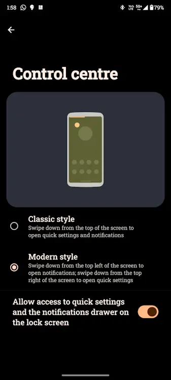
The media player is neatly positioned between the top section and the bottom portion, which houses the icons. However, if you prefer a larger media player and progress bar, you might not be a fan of this layout. Fortunately, you can easily hide the media player by clicking the edit icon in the Control Centre, which is a useful feature.
From the home screen, swiping down from the top left corner brings up just the notifications, while swiping down from the right corner summons the Control Centre. This approach is similar to Apple and Xiaomi’s method. You can also revert to the classic Control Centre, which still retains the background blur.
Overall, the aesthetic and utility-rich presentation is top-notch and significantly better than MyUX.
More Customization Options
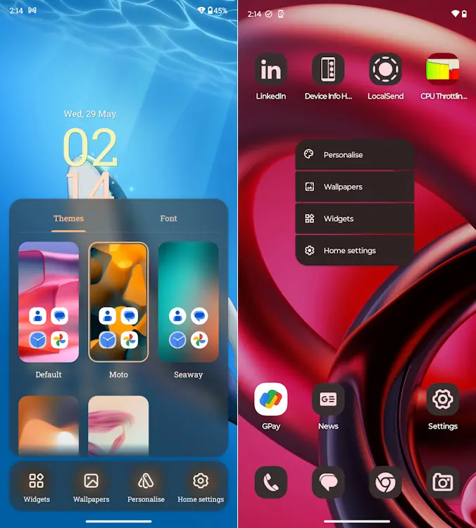
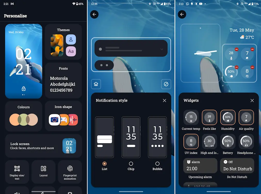
The personalization settings in Hello UI are now more intuitive. Previously, long-pressing the home screen offered a very limited set of options, and you had to delve deeper into settings to personalize anything. However, Hello UI introduces a more detailed home screen settings panel that allows you to instantly change the Themes and Fonts without visiting the Settings app.
Moreover, the Personalization settings now include a new Lock Screen customization option. This feature allows you to customize the notification shade, clock style, and assign widgets for quick access, which is a great addition.
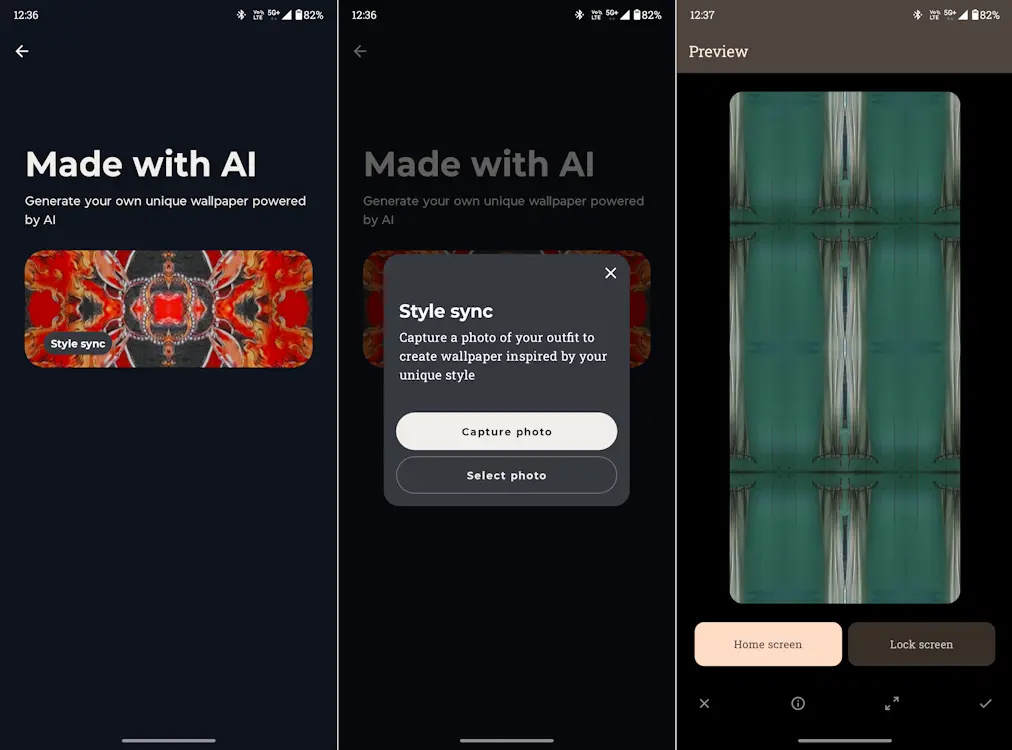
In the Wallpapers section of Personalization, you’ll also find a feature called Made with AI. This is Moto’s version of AI generative wallpapers, similar to those seen on Pixel, Samsung, and Nothing phones.
Unfortunately, the implementation of this feature is poor, and the results are disappointing. It’s unclear how these wallpapers are AI-generated, as they appear to be just random patterns derived from pictures.
I received both the Moto Edge 50 Pro and Edge 50 Fusion ahead of their official launch. Typically, devices get an update on launch day or shortly after to fix bugs and optimize the UI.
But, the BIG Software Update Problem Persists…
Although the Moto phones received Play Store updates for their apps, there was no Day 1 software update for the skin, which is quite disappointing. The Moto Edge 50 Pro is still running on the March security patch, and the Edge 50 Fusion (also running on Hello UI) hasn’t received any updates either.
Although the phones are significantly better now than when they launched with a choppy and unpolished UI, thanks to the Play Store updates, an official software rollout is still desperately needed.
Moto should take inspiration from companies like Nothing, which released numerous updates to fix issues with the Phone 2. Even the OnePlus CE 4 received 2 to 3 updates to address critical problems.
Software updates are crucial for fixing bugs that can ruin the user experience. For instance, there’s a Hello UI bug that causes the notification shade to freeze during calls. This can be quite annoying, especially if you get fidgety during long calls like I do.
Is the New Moto Hello UI Any Good?
When it comes to Android skins, good options are limited, and finding a bloatware-free experience is even rarer. Intrusive bloatware and ads are still common, which is unacceptable in 2024. Moto’s older MyUX UI stood out for being bloatware-free, but it lacked modernity and became boring over time.
With other UIs stepping up their game, it’s encouraging to see Moto doing the same with Hello UI. There’s no doubt that Hello UI is a refreshing change. The incredibly smooth animations on Moto devices with Hello UI are deeply satisfying.
However, the untimely rollout of updates remains a significant issue.
This is precisely why I no longer recommend Moto phones to anyone. When a device doesn’t receive promised updates for improvement, its longevity suffers. Over time, the phone shows signs of aging faster than others, not to mention the importance of security patches.
With a UI redesign, one would expect a brand to address such a critical issue. It’s disappointing because Moto’s lackluster software updates are the only thing holding its devices back from outperforming the competition.
Setting these issues aside, Hello UI is undoubtedly one of the best Android skins available right now.
