This year’s WWDC event was filled with features and improvements for Apple’s devices. iOS 18 was the highlight, bringing a revamped Control Center and changes to apps like Photos, Messages, Maps, and the Notes app. Additionally, Apple Intelligence is set to arrive later this year. However, what excited me most about iOS 18 was the icon customization feature.
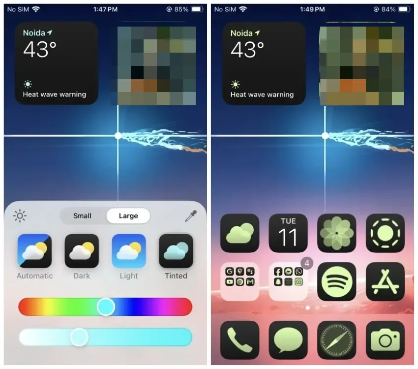
In iOS 18, you can now customize app icons to match the dark mode theme of the UI. Additionally, you can personalize the accent color and tint for all icons, with the default settings matching the color of your background wallpaper.
Accented Icons Over Material You
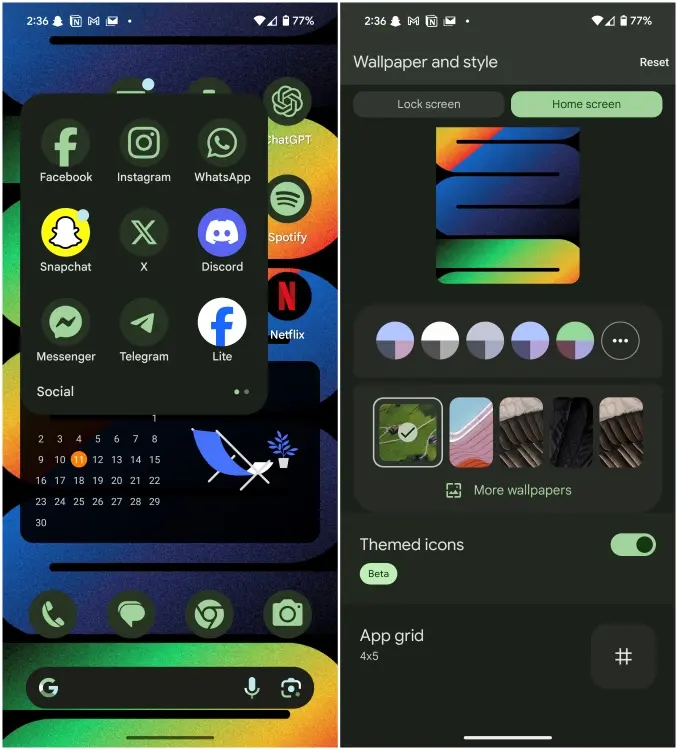
It’s undeniable that Apple drew significant inspiration from Android’s Material You theming, which enables users to apply the same accent color as their wallpaper. However, Apple goes a step further by offering users more freedom to choose the colors they want to apply.

iOS 18 introduces a color picker tool that allows you to select and match colors with your wallpaper. Alternatively, you can use the slider to select any color you prefer. While the result may not always be perfect, the customization is meant to cater to your personal preference for your home screen. This theme applies to all app icons, including third-party apps, and widgets, ensuring a consistent look across your home screen.

Unlike Android, where the color palette is limited to your current wallpaper, iOS 18 offers more flexibility in choosing colors for your home screen. Moreover, the pastel-style colors of Material You on Android have frequently seemed lackluster to me. Furthermore, several third-party apps still do not support theming on Android. It’s worth noting that themed icons on Android are still labeled as “Beta” even after nearly three years since the release of Android 12.
iOS 18 Customization: Not Completely Perfect
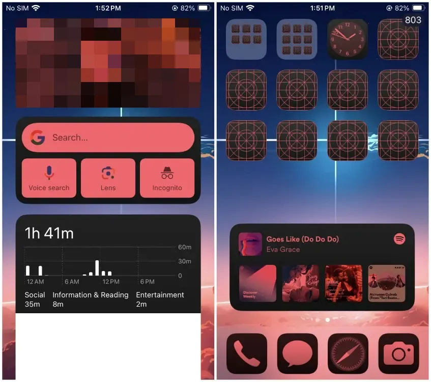
The new customizations are a welcome addition and will certainly give each iPhone home screen a unique look. However, there is room for improvement as it’s not perfect yet. Apple could refine it by, for example, removing accent colors from every widget. For instance, the red tint applied to the Photos widget makes it look like a crime scene, and the Spotify widget is barely recognizable.

The tinted icons should also offer a light mode option, as they currently default to dark with no way to change it.
Dark Theme Icons Complement Dark Mode
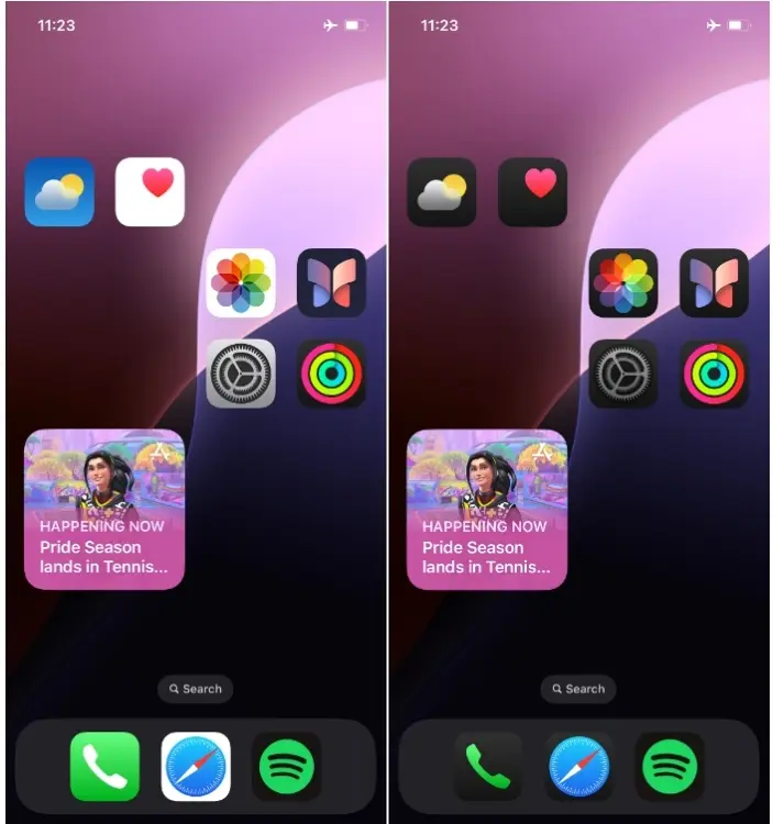
Apple also introduces a dark theme for app icons, preserving their original colors while adjusting only the surrounding areas to match the dark theme of your phone. Below, you can see the difference in icons between light and dark modes.

While accented icons are available, the dark theme is currently restricted to stock apps. Hopefully, developers will bring this feature to their apps later on. I also wish that Android would adopt this approach. I appreciate the look of stock icons, and having them in a darker accent enhances the dark mode and complements the rest of the UI.
For the first time, I have to admit that Android could learn a few lessons from Apple in terms of customization. While I may sound like a complete Apple fanboy, I’ve actually used Android for most of my life. However, credit should be given where it’s due, and these new customizations on iOS 18 seem more appealing to me than what is currently available on Android.
But let’s shift the focus. What do you think about icon customization on iOS 18? Does it meet your expectations for customizing your iPhone home screen? Share your thoughts in the comments below.


