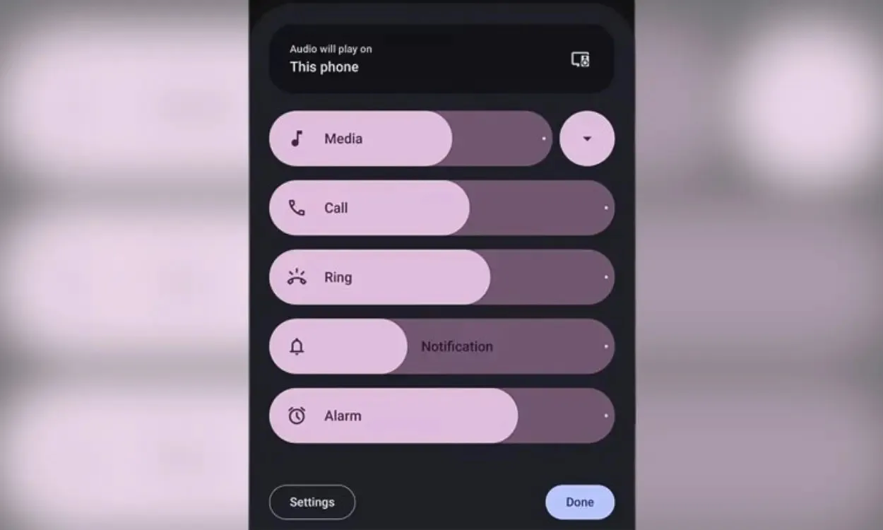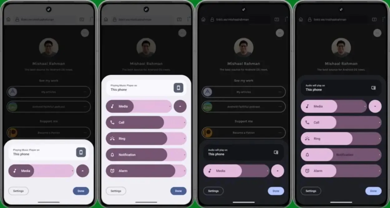
Google’s updates in the Android 15 developer previews have primarily focused on internal changes, but there are hints of exciting features to come in future beta builds leading up to the stable release. As we approach Google I/O 2024, where more user-facing changes are expected to be unveiled, one recent discovery suggests that Google might be redesigning the volume panel in Android 15, which looks promising.
Despite the various UI/UX updates introduced by Google since Android 12, the volume control panel still retains its old sliders instead of adopting the Material You-styled ones. This panel appears when you press the volume rocker and tap the three dots.
Mishaal Rahman, as reported by Android Authority, was able to manually activate the new Volume Control panel in the latest Android 15 Developer Preview. The volume sliders are now thicker, and the option to change the output device has been relocated to the top, making it more prominent compared to its previous placement within the menu, where it was harder to notice.

According to Mishaal, the slider icons in the new volume panel are interactive, allowing users to easily mute or unmute the stream by tapping on them. Additionally, this panel collapses when the arrow beside the “Media” volume stream is pressed. When media is playing, the panel is collapsed, and when there is no media playing, all the sliders are visible.
Unlike before, the media output now appears regardless of whether media is playing on the device. When there is no media playing, the output displays what is handling media playback, and when media is being played, it shows the source from which the media is being played.
Mishaal also mentions that the design is not yet finalized, suggesting that the menu could potentially include features such as noise control and spatial audio when it is officially released later this year. Google is expected to start rolling out this feature in the upcoming Android 15 Beta, scheduled for April.
The current sliders are reminiscent of the Android Pie era and appear inconsistent when compared to other Material UI elements introduced with Material You. While Google could have addressed this during the Android 12 release, it is promising to see the volume panel finally receiving much-needed attention with playful animations.


