
It’s not uncommon for Android manufacturers like Xiaomi, Vivo, and even OnePlus to take design inspiration from iOS. However, it seems Google is now following suit. An APK teardown of the Google Phone app has revealed a redesign that bears a striking resemblance to iOS.
As reported by Android Authority, Google is testing a revamped incoming call interface that closely mirrors the current iOS call screen. The updated design includes two clear options for answering or rejecting calls.
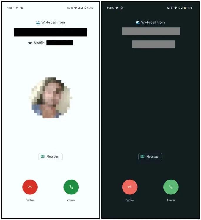
In the current version of Google’s Phone app, you swipe up to accept a call and swipe down to decline it. While the two-button layout is common among other Android manufacturers, what makes this redesign more similar to iOS is the placement of the buttons. The decline button is positioned on the left and the accept button on the right, just like on iOS.
Currently, Google’s Phone app has a simple, minimalist interface. However, these potential changes might be aimed at making the transition easier for iOS users switching to Android by offering a more familiar experience. There’s no official confirmation from Google about this redesign, and it’s unclear when it will be rolled out to devices.
Personally, I welcome the change, as the current UI has become a bit stale for me. If we’re taking inspiration from Apple, why not go all the way and add custom call backgrounds too? What do you think about these changes? Do you prefer the new iOS-inspired call screen redesign for the Google Phone app, or do you still favor the current design? Let us know in the comments below!


